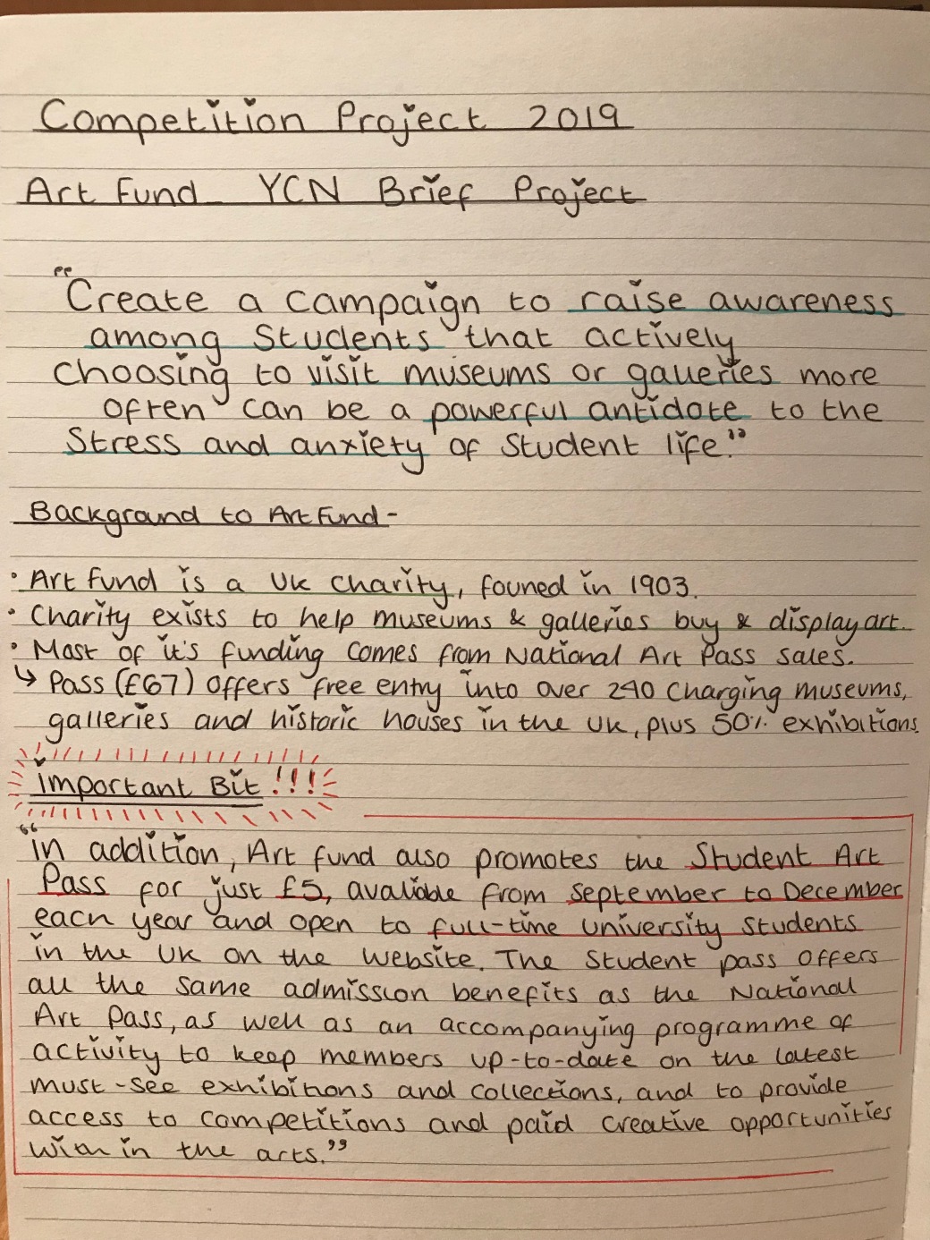
AIM OF THIS MODULE
This module intends to develop skills and understanding necessary to successfully enter both local and national design competitions.
These competition briefs are usually set by working design practitioners and/or their clients, as commercial briefs, they present open-ended challenges that require both originality and focussed objectivity to achieve specific targets and address identified marketing conditions/contexts.
Work will focus on issues of brief selection and comprehension, the development of original and imaginative creative concepts, the appropriateness of the design concepts and ideas and presentation skills.
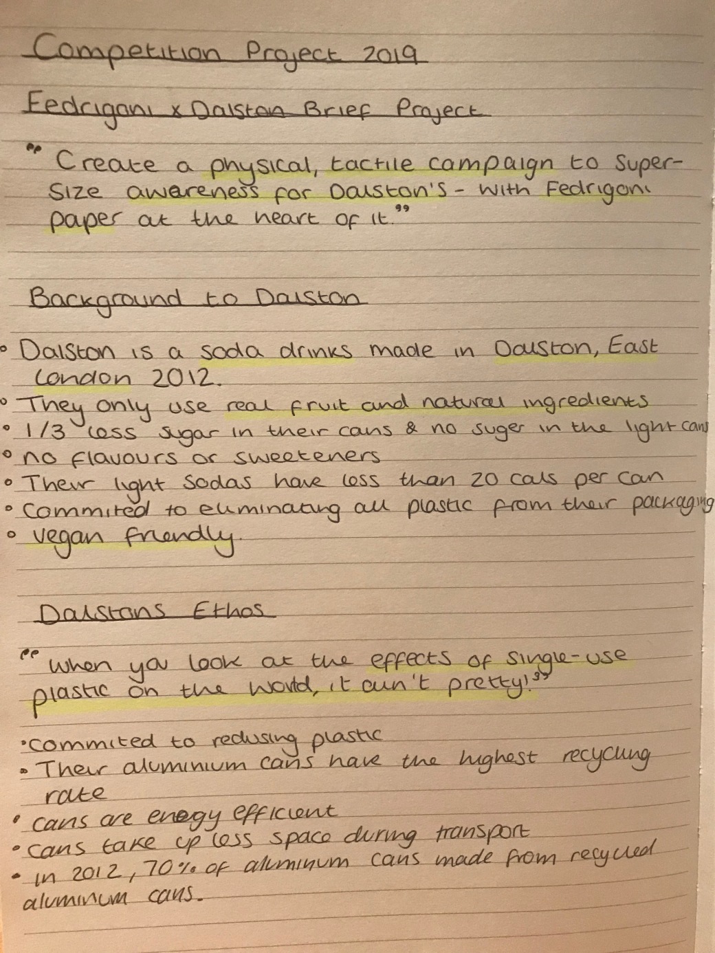
After our introduction to this module By Paul, I looked at the available project briefs set by both D&AD and YCN. I was more drawn to the YCN briefs looking at the Art Fund_ competition and the Fedrigoni x Dalston competition.
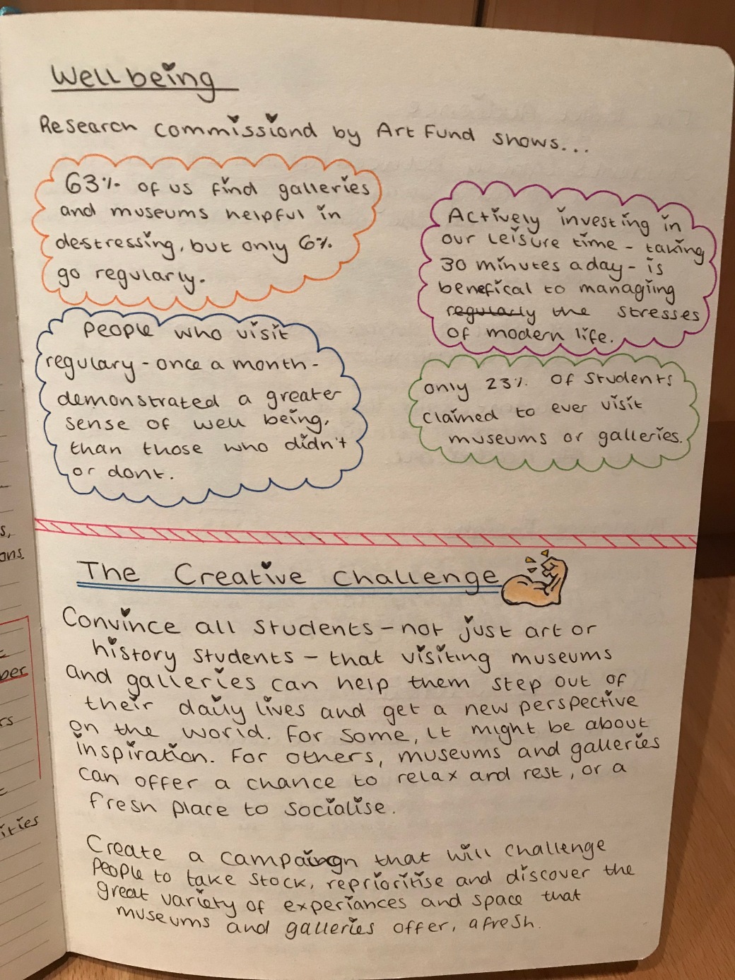
Initially, when talking to Paul I wanted to choose the Art Fund_ brief as its aim (Get more student to visit galleries to destress) was somthing I heavily related to. I came up to with an idea to build on an already current meme trend of ‘classical painting memes’ where classical, medieval and renaissance paintings are turned into reliable memes. By using this already popular a funny artwork, I wanted to build on to make a campaign that both incorporated art that is relative of galleries and well as emotions that students could relate with to create a fun and inviting advertisement for the target audience.
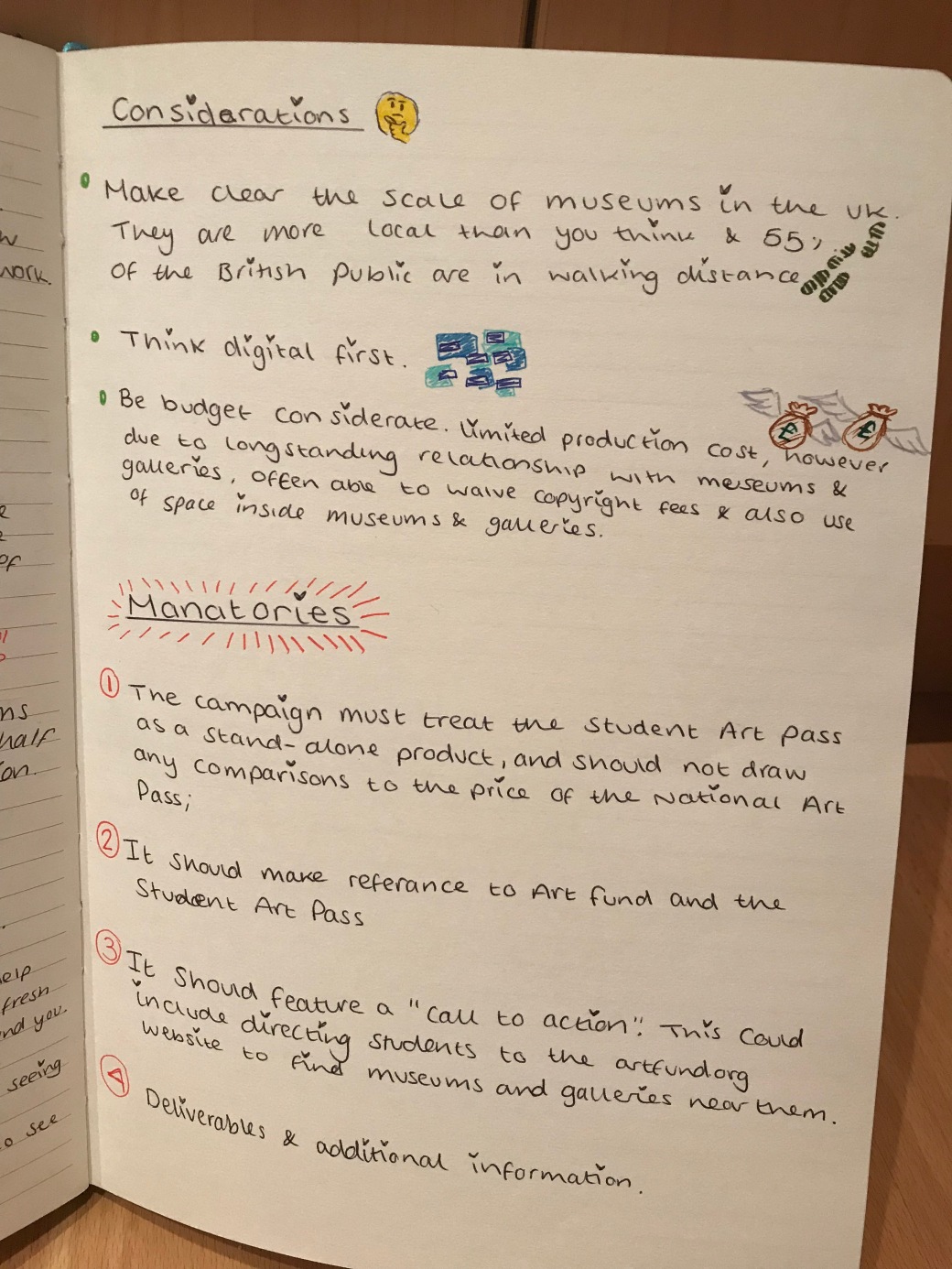
I read through the brief and highlighted important information that was essential or beneficial to my project.

Although I had looked strong into my brief from the start I struggled to find the right way to start working on ideas, whether I working from paper first or started a digital campaign. This along with extremely complexed and detailed brand guideline put me of the project for a long time. Despite trying to revisit the project several times I always found myself stuck before I started and felt I had only one strong idea to run with.
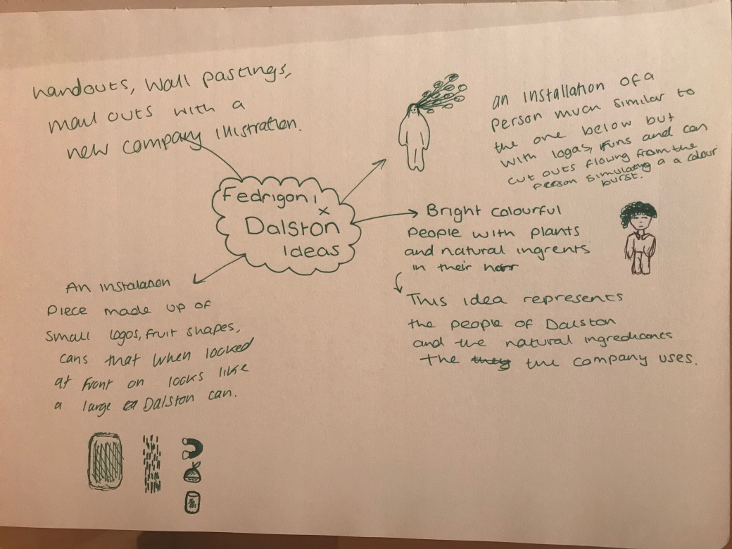
After some time I decided to revisit the Fedrigoni x Dalston brief as it was a much more open and simple advertising campaign. I again researched deeply into the brief and the brand and then began mind mapping ideas for this campaign. Dalston’s design is inspired by an urban East London aesthetic, combining bright, tasty colour with scribbled graffiti-style illustration and protest-style slogans.
Inspirational images that influenced my designs.
I really liked the idea of recreating somthing similar to the Abbeydale brewery citizen illustration as they share similar reasons for its attributes for the design as Dalstons. Both brands are advertising a vegan, more environmentally and natural product, because of this I think is the citizen is the best inspiration for my designs.
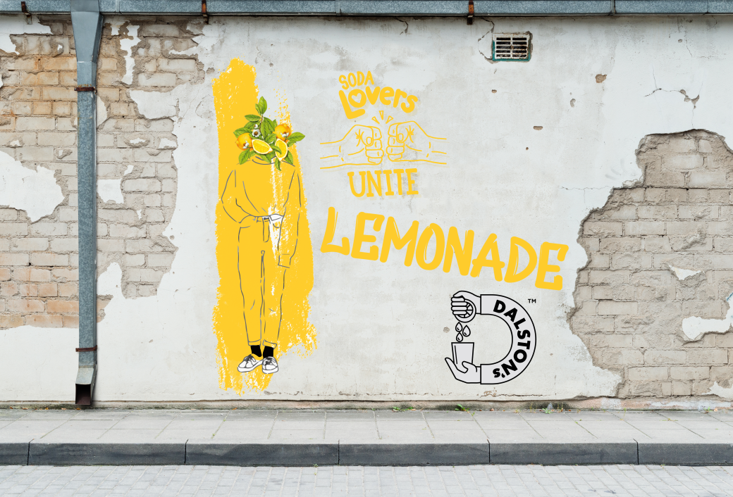
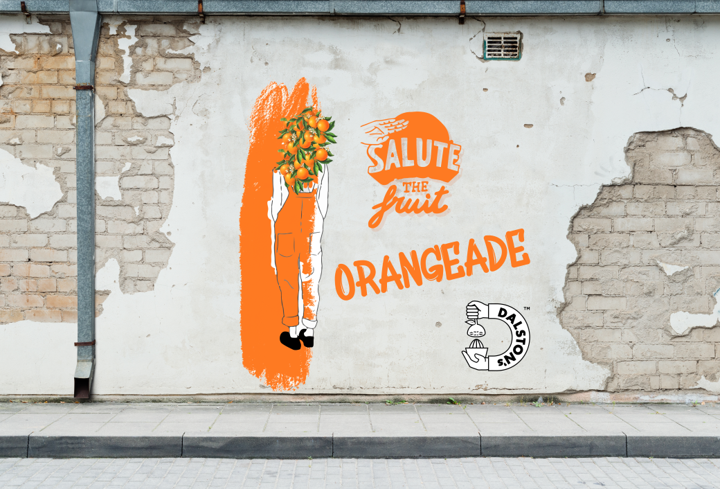
I took illustrations of people and replaced their heads with the ingredients that Dalston use in their soda products. I have used botanicals drawings as I think they offer a more organic and ethical look to the fruit as they are scientifically accurately drawn and not photoshopped or edited to looked artificially “better” or ” more natural”
The bright colours of the illustrations add the bright, colourful and vibrant look that Dalston’s what to use to match the bright, colourful vibrancy of Dalston and Hackney where the brand if from.
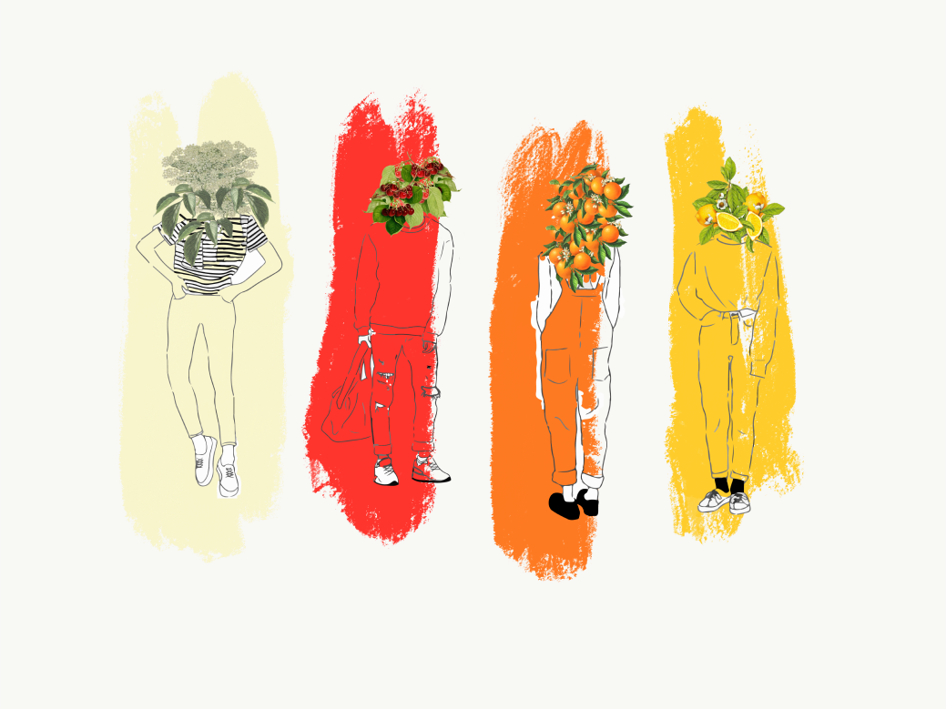
I didn’t want to individually colour all the pieces of clothing and I wanted to incorporate some bright colourfull brush marks into my work to again link my work and the Dalston brand to the area Dalston which is highly influenced and has strong colourful graffiti aesthetics. I used large brush strokes to highlight the figures but also left small parts of the illustration while so I would not “swamp” the drawing and make them hidden. I used colours taken from the fruits to link each person with a fruit flavour personifying the flavours and giving them more of an identity. I think this personification would help attract and grab the target audience attention as the brand and its flavours become more relatable and identifiable once personified. I think this works well as the green from the leaves of the fruits creates a contrasting and separating layer that allows the fruit drawings to stand out while the large coloured strokes help make the flavours more identifiable and recognisable.
Final Designs


I would use Fedrigoni FeADHOC ARCOPRINT High white premium quality self-adhesive paper and board and/ or their ADHOC FILM Self adhesive film to print the wall promotions on. By doing this they can be placed on any walls, windows as displays and buildings.
For the handouts, I would use Fedrigoni ACQUERELLO Papers and paperboards made with FSC® Certified pulp. This would create a high quilty printout and the FSC is in keeping with the Dalston’s environmental ethos.
