Background
Corporate Identity is, arguably, the most frequently encountered and complex type of design work undertaken by practising graphic designers. Whether involved in the initiation of a totally new corporate identity design scheme, or in the production of work within an established scheme, designers will almost certainly work somewhere within the area of Corporate Identity many times in their career.
An effective Corporate Identity strategy enables a company to project itself to its intended market or audience and, if successfully maintained, can make a tremendous difference to the public perception of the company, encouraging credibility, and developing company morale, development, profitability and growth. For a Corporate Identity scheme to be successful it is vital that the visual image reflects positively the attitude, aims, standards and requirements of the organisation for which it has been commissioned.
The Corporate Identity of a company is essentially its public face and consequently must be designed in a consistent and coordinated manner across all aspects of the organisation’s operation. This may include stationery, business forms, signage, vehicle livery, products, brochures, literature, advertising and e-commerce.
Brief
To design a unique corporate marque / logotype for a company operating within a given, specific area of commerce and to apply this marque to a range of elements within a corporate identity scheme. In order to help you develop such an identity, the module will commence with research into existing schemes.
You are required to present design solutions for a corporate identity scheme. You are to choose a specific area of commerce from the following, which you feel will provide you with the most interesting/creative possibilities for such a corporate scheme:
- KLOSS KAMEN: Home Entertainment company (similar to SONY or Bang & Olufsen etc)
- THE VINTAGE CLUB: High-end fashion label specialising in vintage wear.
- THE REAL JUICE COMPANY: A healthy drink brand (similar to Innocent, Boost etc)
- PROJECT PERFORMANCE (+): Sports company (similar to NIKE, ADIDAS, REEBOK etc)
- REACTIV: A Fitness Centre Group (similar to ESPORTA, GREENS, VIRGIN etc)
- ROAM: GPS and tracking equipment for hikers, sports enthusiasts and lovers of the outdoors.
- SPENCER: A Guitar Manufacturer (similar to GIBSON or FENDER etc)
- PURE SOUND: Amplification and associated music products (similar to BOSE, BEATS etc)
- CONNECT: Broadband provider (similar to TALKTALK or PLUSNET etc)specialising in broadband
- REBEL: Street-wear clothing (similar to QUICKSILVER etc)
- ENECO INTERNATIONAL: Pioneers in ecological “renewable energy” and green fuels.
- HOMESPACE: Contemporary interior and furniture brand (similar to Habitat, Ikea, Made etc)
- REVO(lution) HAIR: National hair studio chain & relating products (similar to Tony & Guy).
- CLOUDBOX: Online storage and file sharing service (similar to Drop Box and Google Drive)or…
- An ‘own choice’ company (for instance if you know of a company requiring a new identity
you can liaise with your tutor/s re its suitability as the context for this module)


Designing the manual
The ROAM corporate manual is 28 Pages not including the cover with each page divided 8 columns with a 5mm gutter on each page supporting the alignments used throughout the manual. The rest of the margins are set and applied from the Blurb printing website I will be printing from.
The first and last page of the manual has a vector of map contour lines to the create something visually appealing on pages that won’t be used for information but are a need for printing. This use of a vector all so set a tone and gives a sense of the what the company is from the very start as it shows inspiration and symbolism from original ways for tracking such as using ordinance survey maps.
All the pages number are set 0.0A° which will appear 0.01° and so on, to relate to how longitude measurements appear to add a visual extra which again shows the relationship between what the company is (tracking and GPS) and how we track and find where places are in the world.
I have included all my own Photography to make the project more personal as well as to local small but extraordinary UK places everyday people will see which again shows how the company’s products are for everyday people and not just professional.
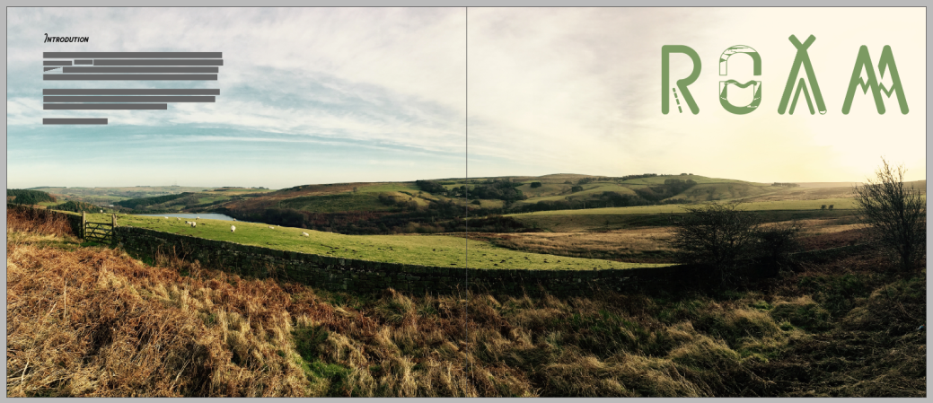
The first spread shows a view from High Bradfield with an introduction to the manual and the prime marque of the company. The font for introduction is Chippewa Falls which I have used for all the heading throughout the manual to set them apart from the main informational text which is Montserrat.
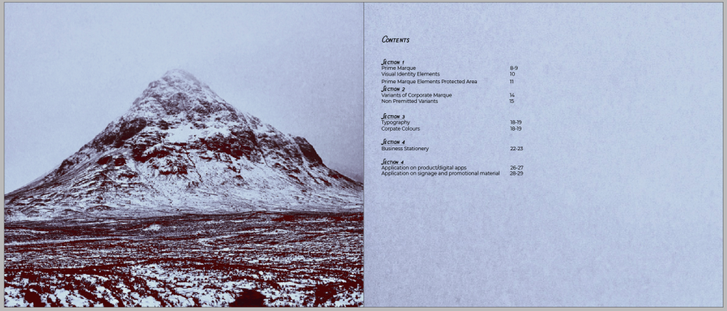
The second double spread is the manuals content page which shows the four sections of the manual and details what is included in each section so it is easy to find a specific section when need. I cover the left-hand page with an image of snow-covered Ballachulish, Scotland to add visual appeal and then duplicated the image and cropped a small section on the sky which I when put on the righthand page and enlarged to create a more interesting background to place the text on and give a sense of continuation across both pages.
The first section of the manual explains how the companies prime marque is made and the visual elements that it contains in order to make the companies identity recognisable. The introductory section page has an image of a cliff/ quarry face in Stronsay, Orkney that intrudes slightly on the right-hand side to keep the image from being stretched as well as again showing continuation across the pages to make it flow easier. I have repeated this with several images in the rest of the book to make them feel less constricted to the single page and make them more visually interesting while being easy to read the information at the same time.


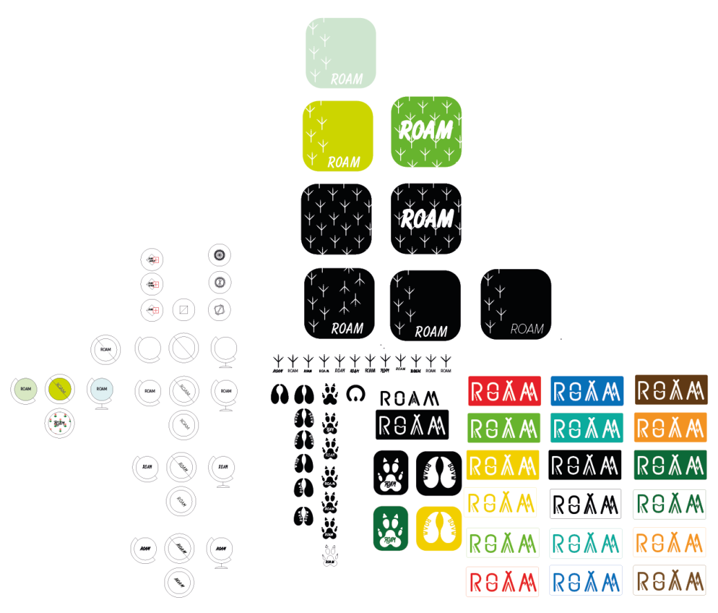
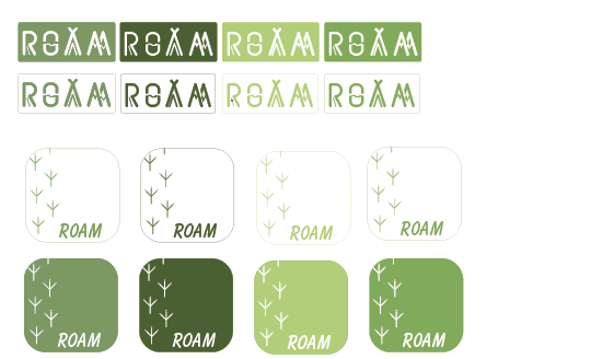
This section shows the logo variants I chose to go with for the company too as well as the introduction of the heron foot symbol with I wanted to include to show symbolism of tracks and something physical with can be tracked.
I also introduced a variant of the Logo which can be used on products with the line of text “GPS and Tracking Equipment” to clearly state what the company is as well as introducing a secondary colour of Pantone Cool Grey 9 C which I think is more visually appealing and soft the black and shows a more earthy grey like the colour of stone. This text is also in the font of Myriad Pro as I thought it worked well with the rest of the design.
Section two of the manual shows the unacceptable and acceptable variants and versions allowed when using and recreating the company logo.


The third section gives details of the colour and typeface I have used to create the marque, manual and what font should be used by any of the companies literature.


The fourth section highlights what the companies business stationary pack how the logo, symbols, fonts and colours will be reproduced on to letters, compliment slips and business cards. I really like the small details I have included on the business pack like the heron tracks across the letter and business card as well as the latitude and longitude of the company in the address and well as having a fluid business card where the photography and the front can change.


The last section shows how the companies marque can be displayed on advisement and products.


Evaluation
- I think my colour choices work well together and create a soft and environmentally aware design that fit the identity of the company well.
- My choice of fonts and how I used their variants (regular, stencil, bold, medium etc) work well together and I have used the variants to create the best possible version that looks good aesthetically.
- I really enjoyed being able to add my photography as I think it makes the project more possible as well as in the manual be able to show examples of very different environments that can be found which show people from different areas will experience different environments when out walking, running and exploring.
- Next time I think need to use better techniques when making the logo as although I think it looks great visually when adding sizes and measurements it was kind of difficult as nothing was a standard size and a lot of the elements were .7 or .3 instead of 1 or .5
- I definitely need to improve on-time manage meant when working on projects with such detail and so much to do as I feel I started off well but over the long time period lost interest and then struggle to catch up at the end and didn’t take in to account problems that may occur like my computer not coping with the size of the files and small details that needed to be added.
