Background
Each year we work on a project for Interior Educators, hosting a huge student exhibition for UK Interior Architecture and Design University courses. The venue is a 50,000 sq Ft space, over 3 doors at The Old Truman Brewery on Brick Lane, London. The challenge we face each year is making an impact on the vast space, allowing navigation around the exhibition to be clear, while not interfering with the student work.
For your project with us, we would like you to brand the exhibition and space, demonstrating a creative approach without too much restriction. The branding can roll out onto vinyls, banners, window graphics, navigation around the space (could be on the door) and general way finding.
The design of the branding elements needs to communicate Interior Architecture in some way, this was done through graphics and structural bricks last year.
Please consider the recyclability and sustainability of the materials used.
Deliverables
Brand/Logo Identity
The exhibition needs a creative brand to make it stand out at this show. An event name and theme which is inspiring and reflective of interior architecture and design need to be presented as a logo identity.
Event graphics
Event graphics for use within the exhibition space, including ideas on how this can be displayed, will it be a purpose-built structure, projections? This is where the consideration of sustainability and recyclability of materials will be useful.
Internal banner
Then choose x2 of the following to work up the design:
Window graphics, facing Brick Lane
Catalogue Cover
An event invite
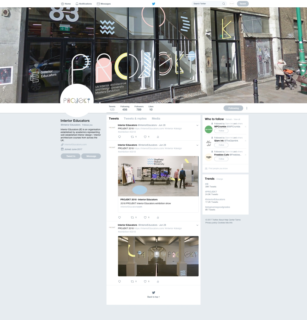
Social media, demonstrating how this will be rolled out on Twitter
Previous issues Deadlines
Last year we created colourful cardboard boxes/bricks. They looked great but took a long time to assemble and left us with a lot to recycle after the event. Just consider that there will be a team of 6 designers, and they will have 1 day to install.
Deadline
Initial creative, with feedback session – Tuesday 17th April at 1.00pm.
Project complete-Thursday 10th May (2.30pm)
Research
To start the project I looked at some of Fields previous work for the Interior Educators show as well as looking back over the presentation they gave to us and some of the good examples they had included. From this, I took inspiration from some of the very linear and structural designs such as the OK-RM Strelka Festival design and the Upper Mills Re-Imagined design. I think to create something with a sense of structure will play a part in visually representing the architectural sign of the exhibition.
I then went to the Pinterest and looked at different colour, fonts and shapes to get an idea of what styles I like and think would be appropriate for this project. I really like the way look of black outlines giving a sense of structure to the word or letter and these bright colour behind filling and creating the shape without taking away from the information. I think this creates a very visually strong and interesting design where colour, shape, and type all work in contrasting balance. I looked at more unconventional typefaces as well to see how creatively effective they could be instead of standard typefaces that can be found already in a font book. I think unconventional typefaces make type become more of pieces of design on their own rather than there for purely informative needs.


Now that I had an idea of the style I wanted to create I began to look at names for the event. I look at words that are associated with architecture, interior and design that I thought make good names. I also looked at words in different languages as many were recognisable as what the meant in English too but appeared more visually interesting such as Interiör (interior) and Architektur (architecture). As the exhibition included architecture, interior and design I wanted to find a word that was inclusive of all of these so looked into the developing the word framework. I thought I was a good starting point as it was inclusive and in context to the exhibition as it is about degree work and the framework to the student’s careers as artists.
I and Paul both agreed framework was quite a boring word to use so I went back to look at words in different languages. I can across the word design in polish which is Projekt. I really liked the word as I think it was readable as the word project which fit the context as the exhibition is a set of student projects, it meant design was inclusive as to would the show featured as well as being visually interesting and stimulating.
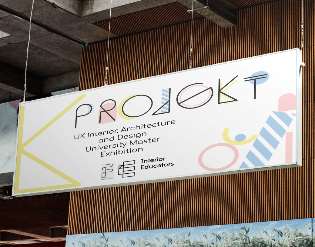
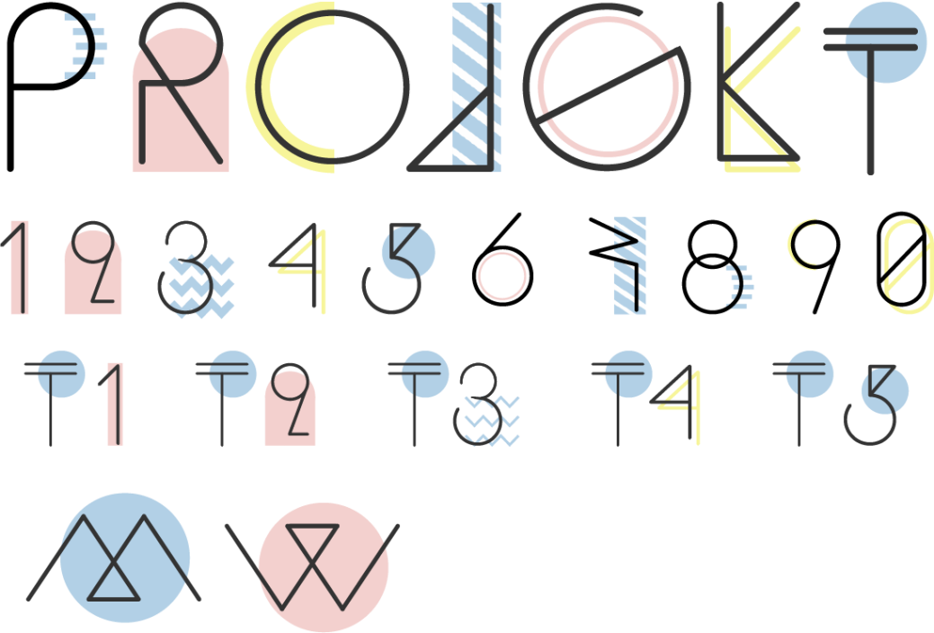
I decided to use PROJEKT and looked about the style from Pinterest to see how to develop the word into a styled branding.


I instantly liked the sixth idea down of projekt as I think it’s the most effective design. I feel that the black angular lines represent structural architecture while the soft shapes and muted pastel colours represent the soft furnishings, colour and patterns associated with interior design.
They both work together in balance much like architecture and interiors do in real life and complement each other without taking away from each other. The pastel colours work well as a design choice because they are subtle enough to allow the individual shapes to exist alongside with the typeface without making the design appear busy or overpowering it.
This design also shows style influences De Stijl and Bauhaus with the use modern horizontal and vertical lines and primary colours to create a pure, simple but effective design.


Development

I began development by finding a typeface I wanted to use for the main title of Projekt. I choose Sequi as it was the most similar to one that I had found on Pinterest and liked for its use of structural form. I altered some of the letters in order to make them more readable such as in placing two lines on the T instead of its triangle.
I then began to create the secondary elements (coloured shapes) around the letter, each one with its own shapes designed to fit around the structure of the letters.
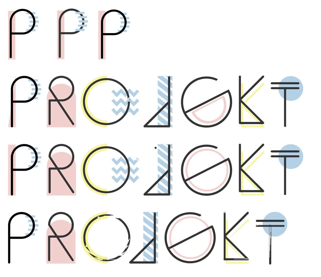
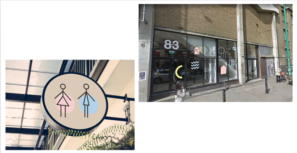
From this point, I then began to develop numbers, directional arrows, the area zone names and ideas for displaying the toilet signs in the same way. I wanted to make the toilet signs more innovative and original as well as trying to move away from a woman in a dress and a man suit. I feel that with current trends of gender change and fluidity they are being outdated and stereotypical. I would have liked to move way also from “pink is for girls” and “blue is for boys” but they simply are known now symbolically for those genders and I felt at this time it may become confusing if I discounted them too. I looked at using chromosomes but felt that people would struggle to identify with gender is which even with still using the pink and blue. I held this at a point for further development after the midpoint review.


I began to get my work together to present to Katie and Eric from the Field Design company for our midpoint review so I lastly looked at what typeface I could use alongside Sequi for larger bodies of type and subheadings. I look through Adobe Type kit for this and wanted a modern soft sans-serif that would complement and work well alongside the Sequi. The two that I took note of was Comfortaa is a rounded geometric sans-serif type and Poiret one which was more of a decorative font but still worked with my original font. I held this at a point for further development after the midpoint review.
MidPoint Review
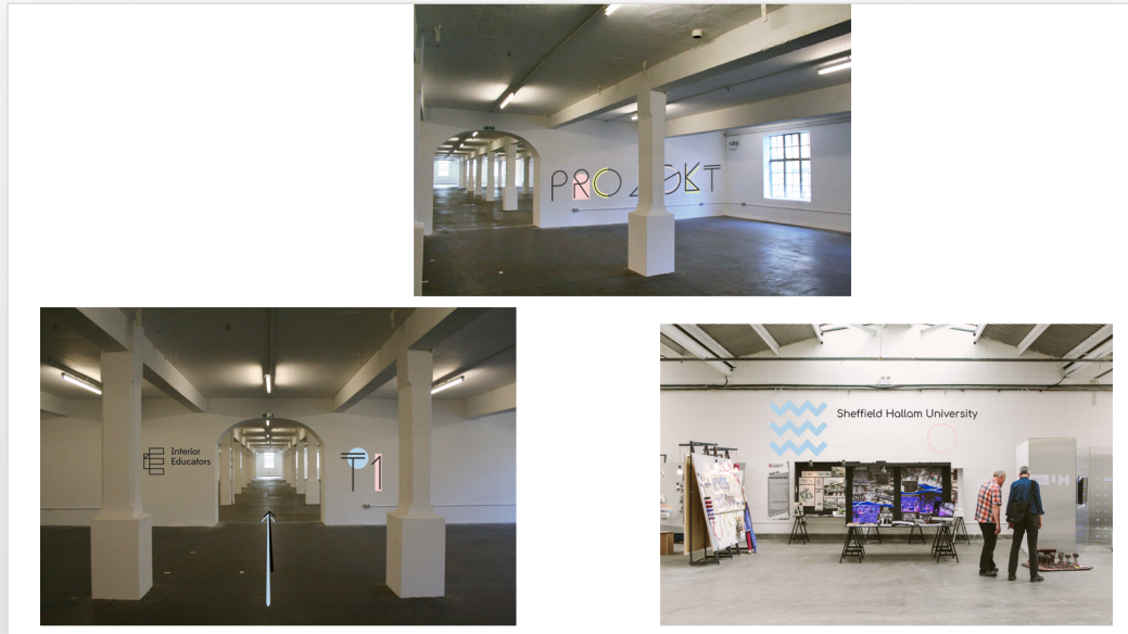
I made a short and simple power point presentation for Katie and Eric as I knew they were short of time and just explained to them how I’d got to my recent point of development and my thoughts for developing further. I also included my first mockups for vinyl graphic inside the venue.
Feedback
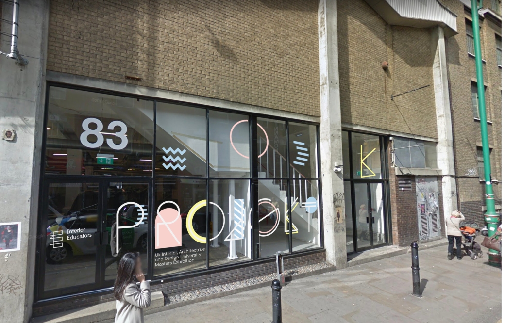
The feedback I got from the field was that they really like the typeface and how it worked with colours and shapes as it was well balanced. They liked how I had begun to look in developing more original symbols for the toilet sign and just to carry on development to create something more unique. They suggested making the brink lane window graphic with white type to stand out more as well as looking more at my size, scale and distributing. Lastly, they also suggested looking at stacking the type for the university names and being braver again in the scale of the graphic going across the walls.
All of this was really great feedback as it helped me know what I need to focus on developing more and how to take the next stage of development to a new level.
Further development
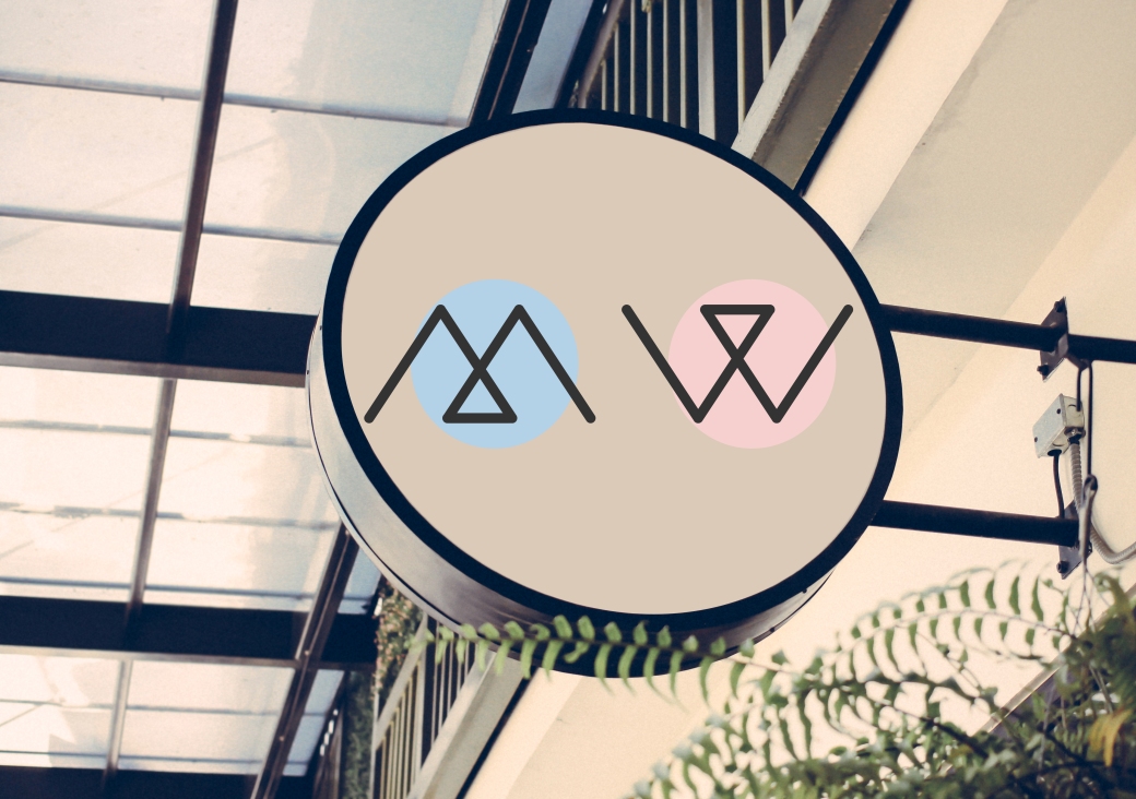
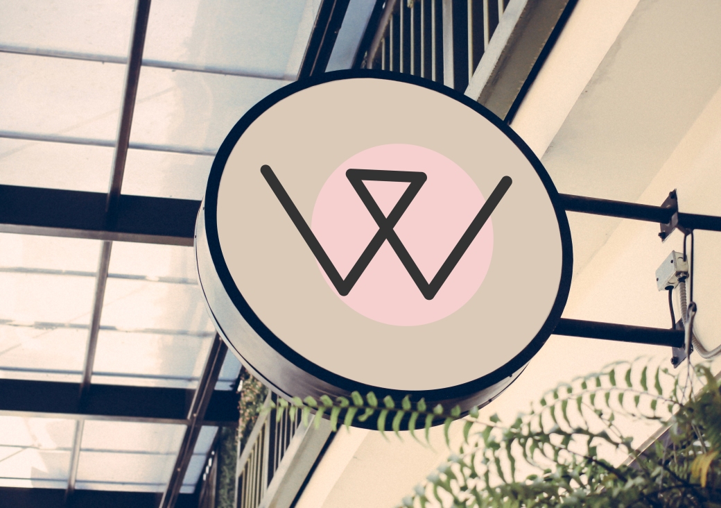
I first revisited the toilet signs and began deconstructing and reconstructing the shapes I had already made such the triangles and really liked the idea of just a W and M made abstractly from layering triangle. I think they are really effective and work well with the style of the other elements. I add the pink and blue circle to just again subtlety show with gender is which as well be in keeping with the rest of the design, having off black type on the coloured shapes.
I also decided that to change the type to a very subtle off black dark grey/charcoal colour just to give a very slight softness and less harsh than fully black and applied this to all the type.
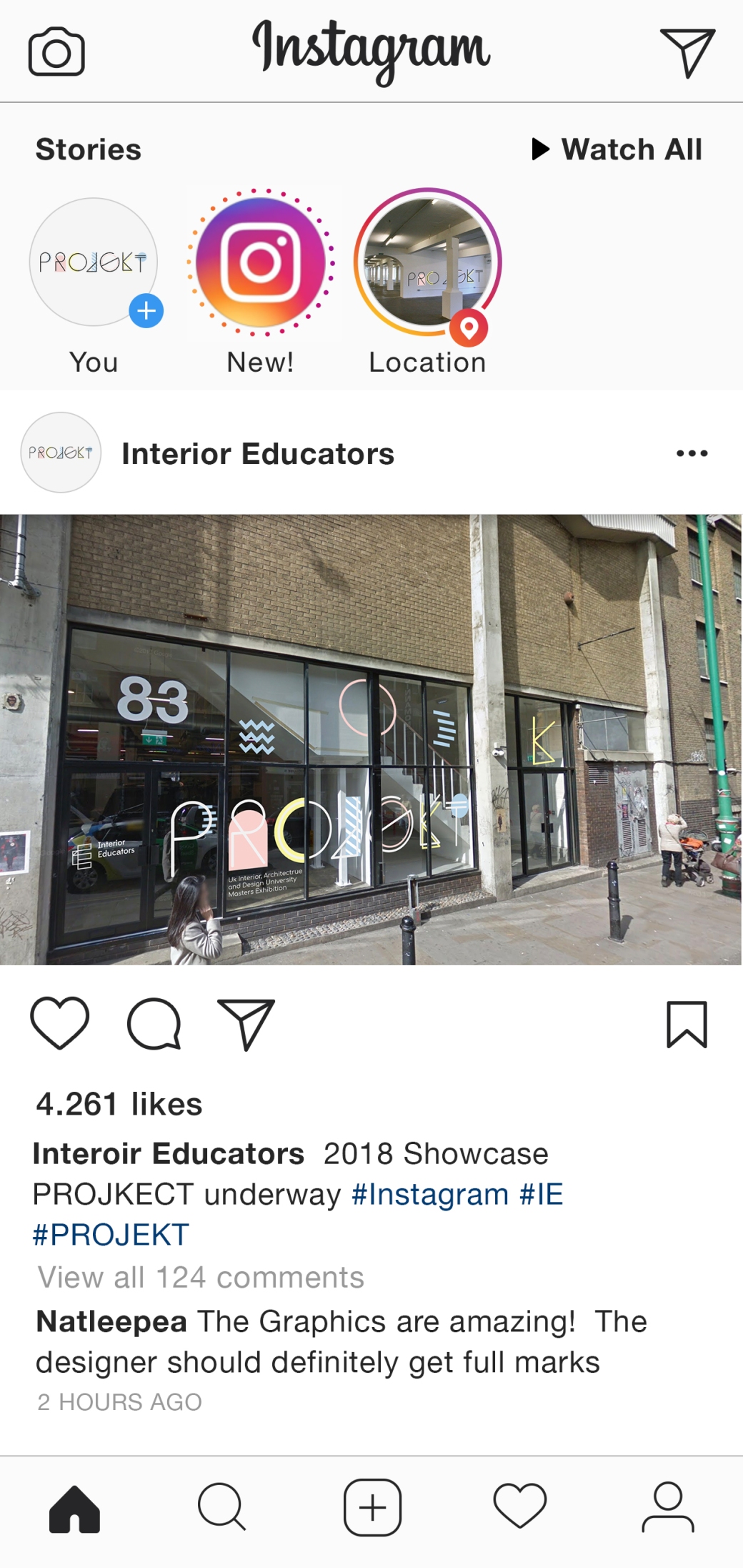
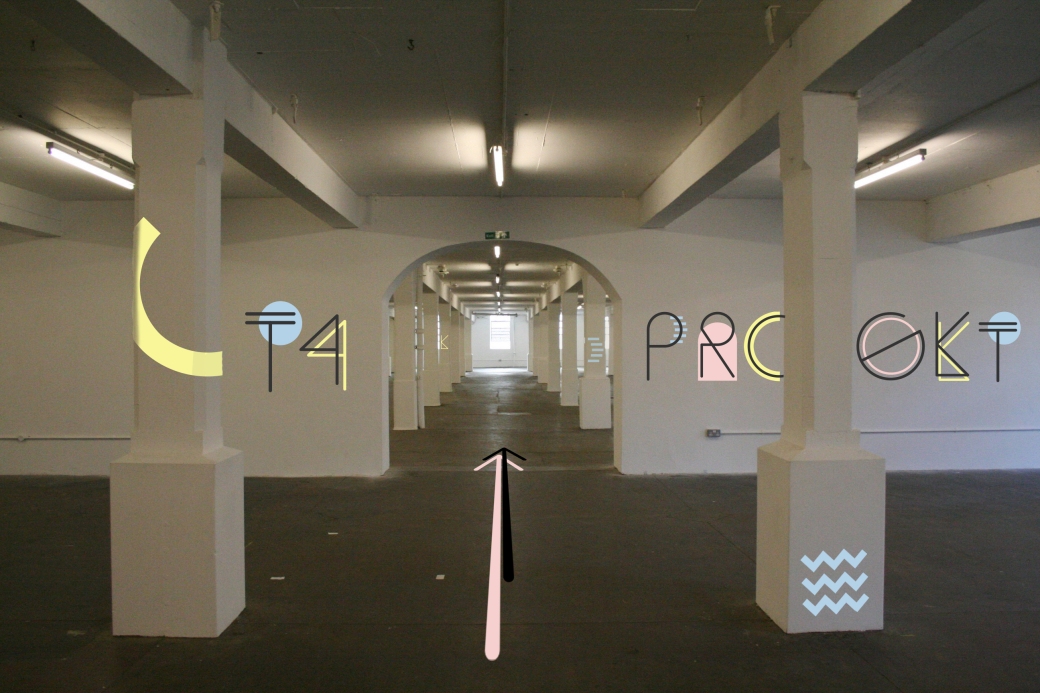
I then looked back at how to improve the vinyl graphics including the window and university spaces taking in to account my feedback and scale, placement and text colour. I change the window graphics text to white and placed the event name larger across the bottom half of the window with fewer secondary elements at the top to decorate but not overpower.
For the graphics inside I choose to use Comfortaa as I feel its round softness works best with the other elements in my design especially the main sequitype face. I stacked the text and altered its placement as well as increased the scale of the secondary elements to create a bigger impact on the space.


Event graphics for use within the exhibition space
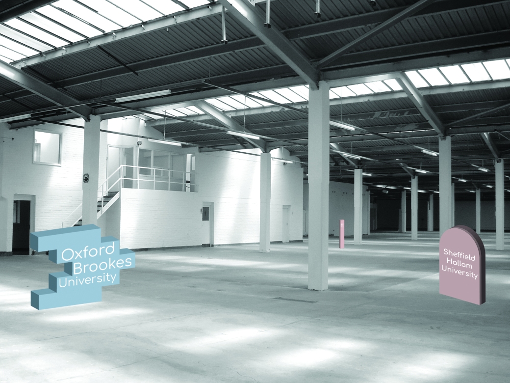
Last year Field displayed event information by creating brinks that could be build up to display information around the exhibition space but had a problem with how much recycling was left after the event. I really liked and wanted to redesign somthing similar to fit my branding that reduced this problem of recycling so many small pieces. I created mock-ups of large shapes that could be made out of recycled cardboard and easily assembled as they would all be large individual net shapes. By creating large singular net shapes fewer people are needed to assemble and disassemble the shapes making them more effective. They also bring the secondary element shapes to life by making them 3D instead of only having 2D vinyl on the walls. The only downside is they may be hard to transport unless a big enough van/truck is used.


Other Design factors
As part of ouronly downsideo need to choose two of the following, Window graphics, facing Brick Lane, Catalog Cover, An event invite and Social media, demonstrating how this will be rolled out on Twitter. After discussing with Paul that we would all should all be able to complete design for all the other graphics need before our deadline I began making mock-ups of lanyards and social media accounts to add the project and show a better interpretation of my branding.
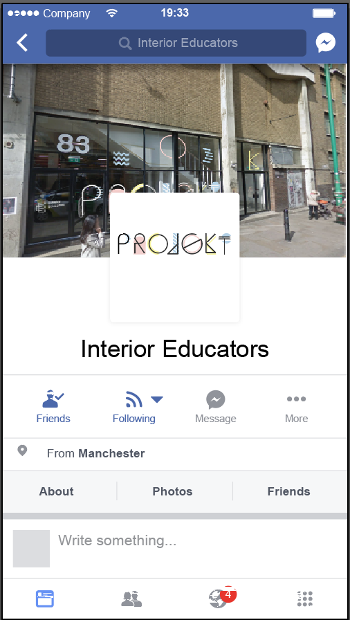
Social Media
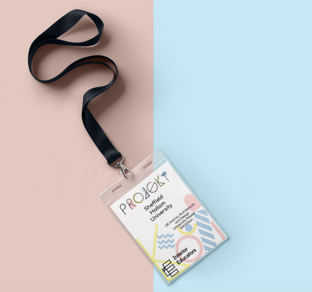
Lanyard and Internal Banner


I designed the lanyard the all the secondary elements stacked balancing on each other at the bottom to add colour and a sense of fun to the design whilst adding the information in on a top layer to carry on the brand style of text layer on top of shapes. This also allowed the text to sit well arranged and in line with where the elements sat making the design visually appealing and balanced. I also designed the neck strap to match the lanyard pass or just to be used on its own. I think using both together would be very busy but I wanted to design both the strap and pass just to show how the elements could be used.
For the internal banner, I continued to use the same elements that i have used on the other piece of design to create a recognisable brand.
Event Invitation
For the event invite, I wanted to make a something really interesting and different rather than just a standard A5 Square so I did some research on Pinterest of innovative designs and the ones that I liked the best were very different and showed architecture with fits with the events.
I really liked the cut of the skyline as I think creatively it adds something really different and visually stimulating. Taking inspiration from the first image of a three-folder laying design, I developed the idea of architectural cut outs more and link it to the event better I have the idea add one tier with furniture that symbolises the interior design aspect of the event alongside the architecture.
The best way to get the finish I need on such small detailed cutouts was to use the colleges’ laser cutter, so I began creating a vector that the laser cutter could read and follow.
After consulting with Matt and Andy Holms about using the laser cutter and checking the design was okay to use we began cutting out the invite mock-up. It came out really well and think it was really effective. The only downside to using the laser cutter was that on the side facing down it was exposed to a lot of smoke which discoloured the paper. I think using a brown recycled paper on the final version will hide a lot of the smoke discolouration with the natural brown colour of the paper as well as it the description in the brief to create a design that is recyclable and sustainable.
For the final version, I have made a mockup of the event information as well adding small colour details with will bring the design together with the rest of the branding.

Catalogue Cover


When designing the catalogue cover I wanted to take elements from the lanyard design and event invitation design to link all the extra design pieces together. I carried on the theme of layering by creating a front page with the event named and description on as well as a negative space cut out. The cut out shows the furniture shapes and part of the building shapes which I used on the invitation with a panel of the negative space around them cut out revealing a second page of showing the stacked balancing secondary elements on each other at the bottom to add colour and make the design more innovative and fun.
Finals

Final Evaluation
I think my design has met the brief overall really well and shows a variety of creative thoughts and processes. I have developed my ability to use photoshop more effectively and am now able to add text and shapes to photos as well as alter perspectives. I am also more confident in creating vectors in illustrator that I can edit to be used for web, printed and laser cutting.
I think I made a really design from the start that I was able to change and adapted to meet the requirements of the brief well with out having to redesign to much of my work. I think that if I had used my time more effectively I would have been able to experiment more how fluid my design could have been.
My branding materials have been a mixture of digital media, vinyl and paper which I think are effective as they are easy to produce and display with is vital for such a small team that will be attending to set up the event. The use of digital media and recycle paper also are positive materials as they are sustainable and environmentally friendly.
I really enjoyed this project and felt really free to try a style that I haven’t done before I feel like I could have been more creative if I had managed my time better but this is something i want to get better as next year.
