Formalism
Formalism describes the critical position that the most important aspect of a work of art is its form – the way it is made and its purely visual aspects – rather than its narrative context or its relationship to the visible world. – Tate
Colour
Colours stimulate our brains in different ways and thorough colour we can experience different emotion because of the colours we see in nature or on manufactured products, as well as in turn colour can represent the emotions we feel every day.
The Colour Wheel
The study of colour and how it is used revolves around the single concept of colour wheels, these wheels help to explain how colour is created from either light (RGB) or from pigment (CMYK) and furthermore how the relationships between different colours come about.

Colours wheels are structured so that the colours are arranged by their chromatic relationship. Primary colours (red, yellow and blue) are the foundation when come to colour, by blending these three colours together secondary colours (orange, green and violet) can be made. Tertiary colours can then be produced when blending both primary and secondary colours together, tertiary colours include vermilion, magenta, teal, amber and chartreuse.

Primary, secondary, and tertiary c, without the addition of white, black, or a third colour, are pure (or saturated) colours. They are intense, bright, cheery, and untainted colours.

When white is added to a pure colour, you get a tint. Some people refer to these as pastel colours. They are lighter and paler than a pure colour, and not as intense. Tints range from slightly whiter to almost-white.
 When black is added to a pure colour, you create a shade. These darken and dull the brightness of pure colours, and range from slightly darker to almost black.
 When grey (black + white) is added to a pure colour, you create a tone. You often hear people saying that a colour needs to be “toned down”, meaning it’s too intense and they want to drop the level of intensity. Adding black and white in different amounts to a colour subdues the intensity quickly.
Colour Science
Colours on a digital screen appeaer different to how they look when printed on paper because there are different types of light involved, light is either projected or reflected. Gamut also plays a part in what colours we can, Gamut is the scope of somthing, in terms of colour it is the range of colours that certain technology or process can display.
Reflected light is what you see most of the time, its light that reflects of paper, flowers and faces. You eyes can only see a certain specturm of colours, it has a limited gamut. Colours like infared and ultraviolet, cant be seen by humaans as they are out of our gamut.
Projected light is usually fired out of “guns” inside a monitor or “cells” on a LDC monitor. It uses a mixture of three colours to create colours.The colours are red, green, blue (RGB). Assuming your monitor is set to millions of colours, their is a wide range of colours that can be shown, which are all within the human gamut.
‘Traditonal’ litho printing does not have a gamut as big as th human eye. The technology inst there to show all the colours our eyes can see. Monitors, however, can show a wider range of colours and they can appare brighter. There are newer printing techniques, like Hexachorme printing, which goes some way to adressing this problem.
Colours used in litho print and most digital printing are made from inks, in the case of full-colour (or four colour) printing, these are Cyan, Magenta, Yellow and Black.
Colours and Colour Psychology
Colour has the ability to impact how we think and behave. Color directs our eye where to look, what to do, and how to interpret something. It puts content into context. It helps us decide what’s important and what’s not.
We don’t all react the same way to colours, as we all have previous experiences with colours from significant events, cultures, people, and memories. However, there are a few generalities about how people respond to colour.
Colours also play a large part in our culture as they can strongly influence placebo effects. People reacted to colour in different ways which can influence what they eat or how they can feel in different situations. The colour of placebo pills is reported to be a factor in their effectiveness, with “warm-coloured” pills working better as stimulants and “cool-coloured” pills working better as depressants. This relationship is believed to be a consequence of the patient’s expectations and not a direct effect of the colour itself.

The colour red modifies our behaviour: its stimulates and is an advancement colour. When a room is filled with the colour red it increases your heart rate, in turn, makes you feel warmer. This idea that the colour red increases your heart rate also links it to its use to influence people to exercise and be active as well as being used to communicate passion and love as they evoke the same physical effects. The colour red is also associated with Danger, revolution and hunger. It is in foods such as, meats and lobster, which stimulates our primal instincts. Furthermore, many men of power also use red as a symbol of ruthlessness.
“Red is the first colour that humans perceive, after black and white. It’s the colour that babies see first before any other, and the first that those suffering from temporary color blindness after a brain injury start to see again. Red’s dominance is even reflected in how colors are defined: although different societies developed their names for colours at different times and in different ways, almost all of them named them in the same order. With only a few exceptions, the order of labelling colours was generally black first, white second, red third, and then green, yellow and blue.
1. Painting the Cave Red
Scientists have found evidence that over 40,000 years ago, Stone Age hunters and gatherers ground up red clay to make body paint. Another use was protection in the afterlife: in the Paleolithic period, people buried their dead with red powder in order to ward off evil spirits (or potentially neutralize odours).
Red also made waves on the pre-historic art scene. Caves across the world, from Africa to Asia to Europe, bear traces made during the Paleolithic era. Drawings of animals, vessels, and people were made from painting red ochre on the cave walls, like this painting of a thylacoleo (an extinct species of the lion) from the Djulirri rock art site in Northern Australia.

Red is the colour of our blood and our hearts and has symbolized love and fidelity in cultures across the world for centuries. Some even consider wearing red jewellery and accessories as one way to get ahead of the romance game. This necklace from the 13th century BCE is made with red carnelian beads and the gold central spacer features the image of the Goddess Hathor, the goddess of love and joy. Red is also a prominent colour found at weddings, from Roman times when brides wore red shawls to warrant love and fidelity, to China today where red still brings good luck at weddings. Chinese brides wear red wedding dresses, are carried to their weddings on red litters, walk on a red carpet down the aisle, and are kissed under a red veil.

3. Deadly Red
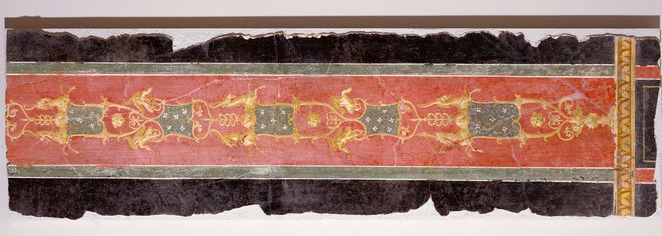
The Romans liked to decorate the walls of their villas in brightly-coloured frescoes. However having the latest look in interior decor came at a price as the pigment they used for the bright red, Vermillion, was derived from the mineral cinnabar: a common ore of the highly-toxic mercury. The miners (usually slaves or prisoners) who extracted cinnabar from the Southern Spanish mines for Roman consumption were essentially given death sentences for their work.
4. Holy Blood
Red, symbolic of the blood of Christ, has played an important role in Christianity and Christian iconography. Cardinals wear red robes and the colour is predominant in public-worship garments and textiles. Adopting the colour was also a way for kings in the Middle Ages to show their God-given right to rule. Red became the colour of regal majesty and power: Charlemagne wore red shoes at his coronation as a visible symbol of his authority, as did Louis XIV in his official portraits.

5. Fortune and Prosperity
In Chinese philosophy, red is one of the colours associated with the five elements of the world: red for fire, yellow for earth, white for metal, black for water, and green for wood. The fire element, and therefore red, is linked to dynamism, leadership, confidence, aggression, and hypersensitivity. When Chinese emperors asked their personal fortune tellers to choose a colour that would bring the most prosperity and good fortune to their reign, red was the answer: in the Zhou, Han, Jin, Song and Ming Dynasties it was the royal colour par excellence and was featured heavily in royal ceremonies. In this Tang-era painting of Chinese Emperors from the Han to Sui dynasty, eleven of the thirteen Emperors wear red robes, symbolizing their royal power.

6. Valuable Bugs
When the Spaniards landed in Mexico in the 1500s they discovered textiles dyed vivid red. In Europe, the substances used for to make red dye (madder and kermes) produced a weaker, browner hue. The Aztec’s secret was cochineal, a small bug that was scraped off cactuses, dried, and then crushed. The Spaniards soon set up an extensive trading system to export cochineal to Europe, where it became a (red) hot commodity.

7. Raising Red Flags
World leaders have used red clothing as a way to showcase their power for hundreds of years. This portrait of Princess Elizabeth I before her accession as Queen shows a young woman preparing to assume her position as a powerful monarch. Her richly decorated red dress and red coif (close-fitting cap) send an unequivocal message of the young woman’s political and moral strength. After the fall of the monarchy, the colour red was then taken up by Revolutionaries around the world to symbolize new liberties and freedoms: from French Revolutionaries and their red Phrygian caps to the Bolshevik, Cultural, and Cuban Revolutions.


Blue is one of the most-liked colours across the entire world and known for its trust and dependability. It’s reliable, responsible, and mentally soothing but has also been known historically to be either elegant, sophisticaded, formal and classy by its use by wealthy or royal figures such as Louis XII of France.
The colour blue is a receding colour and creates a sense of distance. When viewing something from a distance the bluer the hues are, this is due to nitrogen in the atmosphere. Blue can also be seen as a cooling, calming and sad colour. Blue also symbolise authority and importance, such a conservatives, police, bank owners, the Navy an emergency services vehicle lights.
From barbarians to royals, to workers, blue garments have been worn for thousands of years. But when used as a pigment for painting, blue has an altogether different story as the rarest and most precious shade of all. Some artists even went into debt in order to use the colour.
1. Barbaric blue
The Greeks and Romans didn’t have a word for the colour blue. Greek Author Homer would refer to the sea as “wine-red”. Blue was also associated with the barbaric Celts who would dye their bodies blue for battle, women with blue eyes were thought to have loose morals, and descriptions of the rainbow in Ancient Greece and Rome exclude blue altogether. But although the colour was not named, it still existed. In fact, it was one of the several colours used for clothing.

2. Synthetic blue
The Egyptians loved the precious stones like lapis lazuli which could only be found on a mountain in Afghanistan and turquoise so much that they invented the first synthetic blue pigment in order to affordably copy their unique colour. “Egyptian blue” was made by mixing silica, lime, copper, and alkali, and it could be used on stone, wood, plaster, papyrus and canvas. The many decorative objects that have survived until today attest to the presence of blue in Egyptian life.

3. Royal blue
In Early Modern Europe, blue textile dye was made from woad, a yellow-flowered European plant of the cabbage family, native to the Mediterranean. During the Middle Ages, the cultivation of woad in England, France, and Germany helped many towns and regions become extraordinarily rich. However, because the dye was expensive to produce and not steadfast, it was used by the wealthy and became associated with nobility. The working class wore brown and green while the Kings wore blue.

4. Virginal blue
Blue wasn’t only an expensive textile dye, it was also an extremely expensive pigment for painters Because of its cost, it was only used for the most important subjects.
In the Renaissance, nobody was more important than the Virgin Mary. Because she was almost always painted wearing blue, the colour became synonymous with purity, humility, and the divine.

5. Ultramarine bling
Painters had to grind up the semi-precious stone lapis lazuli in order to make ultramarine, the deep blue pigment that is the hallmark of many Renaissance paintings. The name comes from the Latin ultramarinus, meaning “beyond the sea”, because the stones were imported from mines in Afghanistan by Italian traders in the 14th and 15th century. Ultramarine was so expensive that some paintings were never finished because the painter couldn’t afford to buy more pigment. Even Michelangelo couldn’t afford it and Raphael used it only for a top coat.

6. Prized porcelain
Chinese blue and white porcelain has been highly prized since the 9th century. In the 14th century, China began to mass produce very fine, translucent white and blue porcelain in the town of Jingdezhen. This “blue and white ware”, as it was known, used cobalt brought through trade routes from Persia. Cobalt was twice as expensive as gold. Once made, the porcelain was then sold back to the Middle East.

7. If you can’t copy it…
The Europeans tried to copy Chinese porcelain (unsuccessfully!) for hundreds of years. Indeed, China and porcelain were so intertwined, that porcelain was often simply called ‘china.’ When the secrets were eventually leaked in the early 18th century, manufacturers sprang up all over Europe attempting to make local equivalents.
Josiah Wedgwood set up his English firm in 1759 where he perfected a new technique called ‘jasperware’. It took him 3,000 attempts to get the right shade of ‘Portland Blue’ for his first piece, which was inspired by the Roman-era “Portland Vase” on view in the British Museum.

8. Color Wars
Blue was expensive to use for paintings and porcelain, but it was much cheaper to use for clothing. Over time, blue fabric became so common in Europe that it was worn by men and women from all social classes. But the arrival of a new blue dye called ‘indigo’ rocked the European textile trade in the 16th century. Imported from Asia, indigo was more concentrated and produced a richer, more stable blue. Fearing for the national textile economy, the French, German, and British governments tried to block the import of indigo in the 16th and 17th centuries. The blockade was in vain and indigo eventually replaced woad, destroying several industrial centres in the process.

9. Blue Jeans
Jean fabric was first produced in Genoa, Italy in the 17th century; the French city of Nimes copied the technique shortly after (‘de Nimes’…aka ‘denim’). The cotton twill fabric, dyed with indigo, was sturdy and washable, making it perfect for workers. Levi Strauss kicked the fabric up a notch when he patented the use of metal rivets to reinforce the seams on denim pants in 1873.

10. The purest blue of all
Between 1947 and 1957, the French artist Yves Klein perfected what he considered the purest blue of all. He registered International Klein Blue (IKB) as a trademark and the deep ultramarine became his signature. He painted over 200 canvases with the color, as many sculptures, and even painted models in IKB so they could “print” their bodies onto canvas. Klein considered his blue “extra-dimensional,” meaning that it would take the viewer outside the canvas itself.”

https://www.google.com/culturalinstitute/beta/theme/bgIyIXzv_RULIA
https://www.google.com/culturalinstitute/beta/theme/GwLyao99SLXVKg

Yellow is the epitome of joy, happiness, cheerfulness, optimism, anything happy is almost always yellow. The wavelength of yellow is particularly long, making it have one of the most powerful psychological meanings, while also being the easiest colour to visibly see.
However, avoid using yellow too much because it’s also known to make us more critical causing self esteem issues, fear, or anxiety. Find the right balance of yellow to motivate rather than bring others down.
Yellow isn’t as visually strong as blue or red as the are used as symbols of justice and power, yellow is more of a second colour to this. yellow doesn’t not hold authority as it is seen as too youthful. Yellow is mainly used to convey happiness, youth and beginning but golds and brown yellows appear older and not as youthful but are more comforting and warmer.

Pink is seen as rare and represents love as well as being a aspect of red. The colour of pink was not considered feminine until the 1950s due to American toy marketing. Pink could be considered to be a fiery colour/emotion.

Fanta Black absorbs all light

the colour greens were made from poisons and signifies rotten as well as resembles bad/evil when not natural (looking into movies seems wicked act) survival, evolved to line in green places hundreds of years ago, comfortable, greenroom (media performance)

indigo is blue based, magenta is red based. military and spiritual mixed (used by clergy)- above police. absolute, evil? looked at unbreakable film, changes colours coat, colours significant in films

pure, cold, clean, could signify evil artificial

A mix of aggressive red and cheerful yellow, Orange symbolises reliability, strength and safety also stimulates appetite, like red but not as much as snack, melancholy, reflective, looking back over the year, autumn.


Shape
Shapes have there own personalities which can communicate the personality of a product before you even read the text. It’s not always what you say as much as how you say it.
- Spiky- spiky shapes show loud, aggressive and mainly male personalities creating a sense of threat.
- Ascending Direction- ascending directional shapes give a sense of positivity and uplifting feeling
- Descending Direction- Descending directional shapes have the opposite effect of ascending Direction giving a negative feeling
- Round- Round shapes come across as soft, feminine, none threading and childlike
- Vertical Columns- Vertical Columns show a sense of authority and seriousness
- Horizontal Columns- horizontal shapes are considered laid back, relaxed and reclinging
- Square- square shapes have a strong and reliable
- Triangle- Triangles are strong and stable but if they have sharp corners they show a slight underling threat.
- reversed triangle- reversed triangles are unstable but still appear strong and again appear slightly threading with sharp corners.
- wavy columns- wavy columns still give a sense authority if vertical or a laid back feeling when horizontal but with a more slinky and sexy appearance as well
