Brief
You are encouraged to research current alcoholic drink brands (products and promotion) including names, packaging, label design, typographic styles, illustration styles and graphic elements. Your research should influence your brand report and proposed marketing for a new contemporary drinks brand (alternatively you may re-brand an existing product)
Record all research, development, concepts and final outcomes on your Word-press blog.
Choose a company name and initially create a new visual identity, however, this is not a corporate identity brief, therefore, your logo or logotype should not become the focus of this module*.
You may decide to utilise a logotype or marque to form part of the brand identity, alternatively, you may choose to include the logotype/marque more discreetly.
Specific Requirements
- A logotype, marque and/or brand identity for the brand or new company name (see above*)
- A series of bottle labels, packaging and/or bottle caps/tops to promote the product.
- A promotional brochure, any size or format (or magazine if preferred) for the launch of the new
product including a cover (or covers) at least4 double page spreads promoting the product (content should be sourced from existing products and be relevant)
The promo brochure (or magazine) should be printed and ‘mock-ups’ provided for assessment.
You may decide to include potential consumers in the brochure/magazine to promote the brand and create a lifestyle product.
- Promotional items including a range of advertising to facilitate the launch of the new product and a company in 2018, this could include poster(s) postcards, flyers, a wall mural (for a launch party venue or club event) or any other promotional items.
Further Developments
- A website to accompany the brochure/magazine.
- Environmental application of the visual style (banners, street furniture, ambient graphics, mural)
- Further examples of double-page spreads, including die-cut pages, gatefolds…
Research- Alcohol trends
To start researching ideas for the brief I first looked into a wide range of alcohols and the current 2018 trends surrounding them. The brief is very open as to which alcohol could be rebranded or branded, so I wanted to get a good idea of the options available and which ones would be more successful. 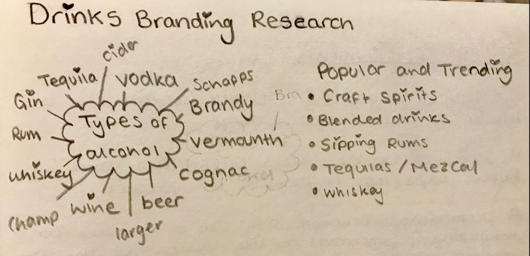
I listed the most popular types of alcohol, aiming to put down as many as possible, so I had a good and clear idea of what I could choose.
Researching into upcoming alcohol trends, as well as trends that have been very prominent in the last couple of years. Shows that; craft Spirts became of the biggest trends of 2017/18 as the number of distilleries has increased approximately 35% per year since 2011. This has also lead to the craft spirits market growing by 19% per year since 2015 (see Figure 3). The U.S. craft spirits market has also grown by around 20% every year by value since 2012 and is predicted to continue to grow 15%-20% per year on average through 2022.

These figures show just how popular crafts spirts have become but I was interested why craft spirits are called craft spirits and what makes them different to other spirts.
According to the Distilled Spirits Council; Beverage information Group; L.E.K research and analysis a craft spirit product is defined generally as “craft spirits are produced by a licensed distillery, which must distil and bottle the products on-site. Furthermore, these distilleries are subject to a maximum volume of 750,000 gallons of spirits per year.”
I found this information very interesting and useful, as it is a big selling point and could be useful when designing my own branding. In order to make a product that would be relevant and successful. This holds important information that I should also consider to refine my product and its brand. Companies that are successfully making a profit from craft spirits are companies such as the Craft Gin Club. The Craft Gin Club allows people to join the club for £40 a month and they receive; a unique bottle of craft gin, food products to complement the bottle, a magazine full of information and recipes.
I wanted to find out what types of alcohol are treading or predicted to tread in the future. I thought this would give me a good idea into what alcohol I might focus on for the project.
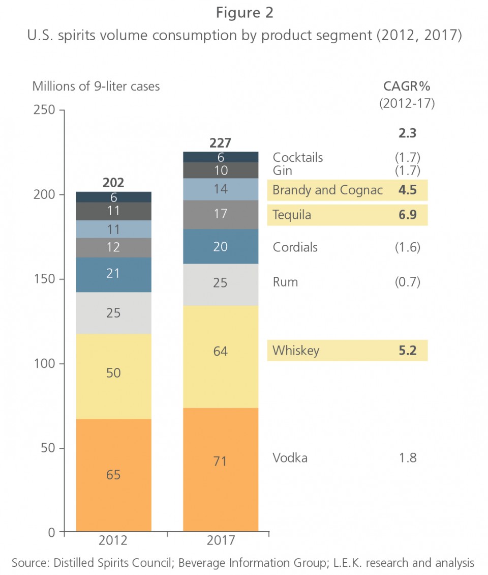
According to the Distilled Spirits Council; Beverage information Group; L.E.K research and analysis Whiskey, Tequila, Brandy and Cognac are gaining in popularity and starting to oversell Gins, Cordials and Rum which have been the biggest sellers and rebranded alcohols of the past few years. Whiskey, Tequila, Brandy and Cognac have made up the bulk of volume consumption growth from 2012 to 2017 (see Figure 2).
The explosive rise in these categories is apparently due to the rise in creative, innovative cocktails and the growing “cocktail culture”. This has helped make liquors such as super-premium tequila, trendy and therefore more desirable.
From this research, I decided I liked the idea of rebranding tequila as it is a product that is popular as well as growing in popularity and a product that I could easily portray as a craft spirit. During my research, Mezcal also gets mentioned a lot alongside or with Tequila. I hadn’t heard of mezcal before but decided to look into it more as it was something a little less known. Through my research into the alcohol mezcal, I found out it had an interesting story and was quite a niche market. Both the history and niche market are points I thought I would be able to use, in order to create a brand and a selling point for the product.
Research- Mezcal
I decided that I was very interested in the idea of branding mezcal so did some research into its history and what makes it unique from other spirts.
Mezcal means oven-cooked agave, which is the plant both mezcal and tequila are made from. Mezcal can be made from any type of agave plant, unlike tequila which can only be made from blue agave. Mezcal is produced by distilling the liquid produced from roasting and fermenting ‘Pinas’, or the heart of agave plants.
In Mexico, mezcal is generally drunk on its own and has a strong smoky flavour. Furthermore, Mexico mainly exports the alcohol to Japan and the U.S
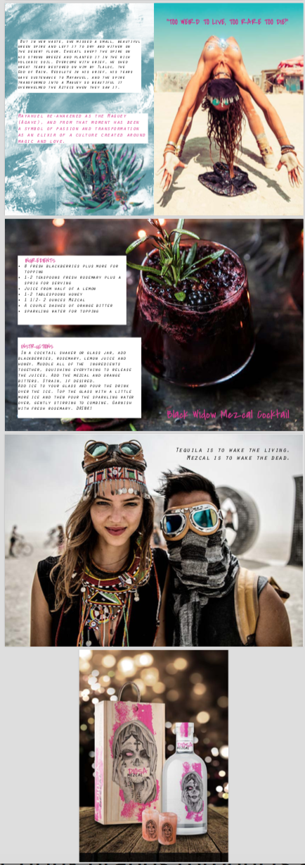
Mescal has a mythical Aztec story of how the drink came to be too which is fascinating and adds an exciting history to the drink.
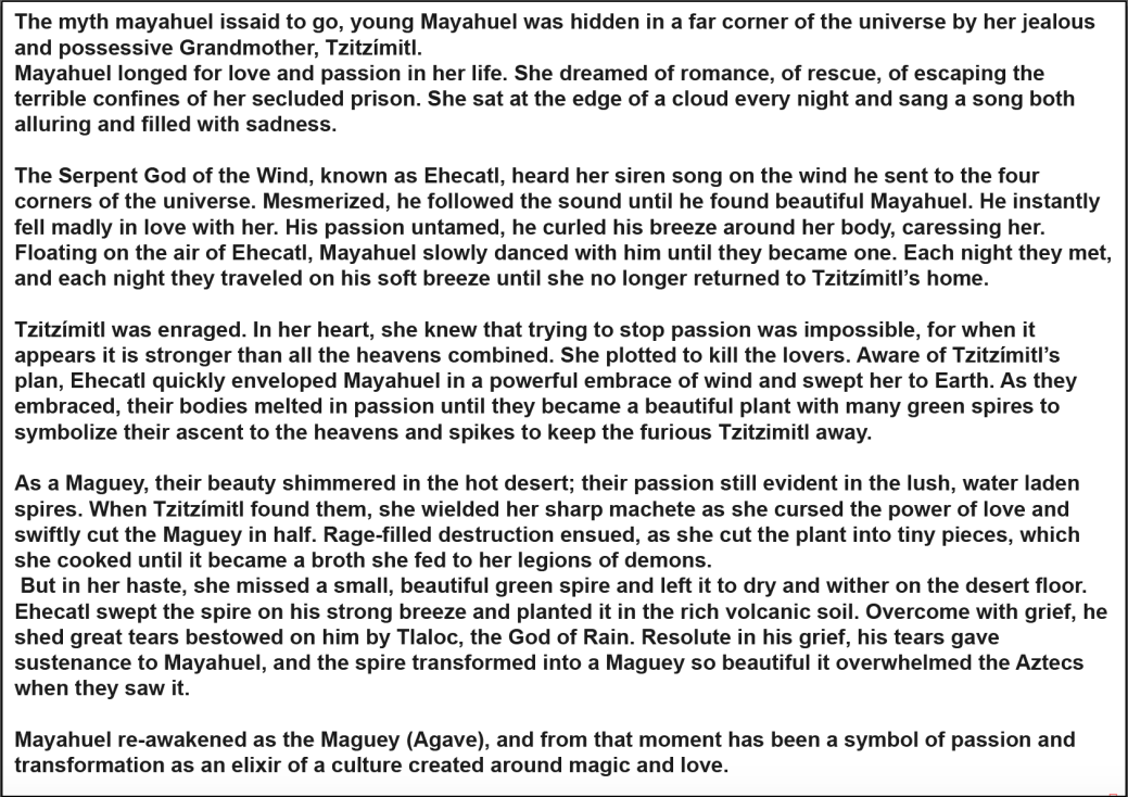
Looking into this myth gives me a good idea of the type of imagery I could incorporate into my designs and helps to give me a starting point.
I decided that I am going to brand mezcal for my alcohol and after looking at current mezcal products, have decided to make a new brand as there isn’t a lot of products out there.
After looking at mezcal brands, I have also noticed a lot of brands have a very tired and outdated look. Barely a handful of brands have modern and or contemporary looks.
Outdated looking designs.


I find these designs uninspiring and outdated and they would be the type of products, as a young adult that I would stay away from. They also look cheap and harsh to drink, whether they really are or not.
Modern contemporary designs


The contemporary minimal bottle designs above, I believe sit well with today’s current looks and trends. As a young person, I would be more inclined to buy and drink these brands. I have also seen brands such has Meteoro in high-end restaurants and bars being used in cocktails. Also, the designs fit in well on display with other contemporary brands.
I think the minimal look of these bottle works extremely well with the negative space, drawing your eye to the design and information. The use of the logos and typefaces gives a slight feel of the product having Mexican heritage, and the bottle being a strong spirit in comparison to brightly coloured busy looking alcopop designs.
First Development
Development- Brand Names
- Martyr
- Elixir
- Dios (Spanish for God)
- Diosa (Spanish for Goddess)
- Elixir de los dioses (Spanish for Elixir of the Gods)
- Corazón (Spanish for heart)
- lágrimas de Dios (Spanish for Tears of God)
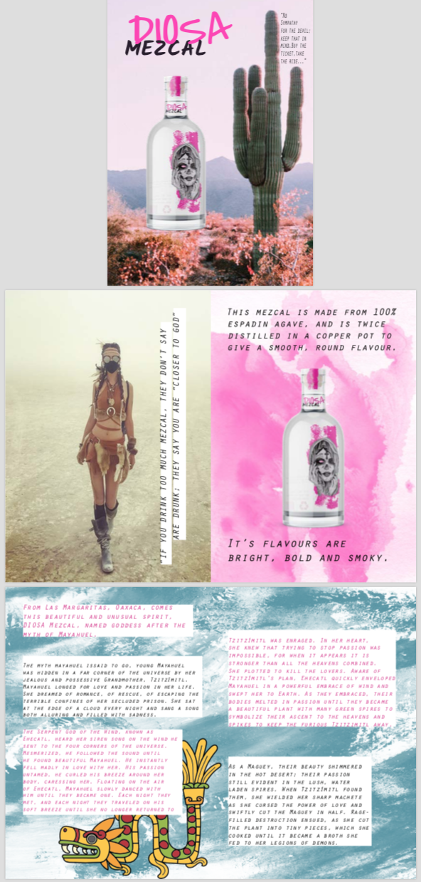
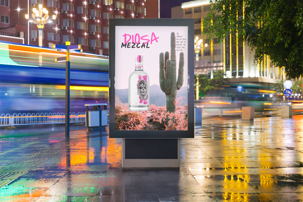
I chose to go with the word DIOSA for my brand name, as I felt it related well with the myth surrounding mezcal relating to the goddess Mayahuel. I also felt that it sounds good, is minimal to say and read and this is effective in making it easy to remember.
Development – Corporate Marquee


This is the result of my first development of a company marquee. I have incorporated a Mexican sugar skull illustration to symbolise and relate the product to Mexico. This inputs Mexican culture as well as replacing the usual roses that are worn in women’s hair with agave, to link the mezcal and the story of Mayauel being transformed into agave.
I added the brand name using the font “Covered By Your Grace” as I thought it was easy to identify, read as well as being youthful enough to attract young adults. While also not being too childish that it would put off an older clientele.
I developed my design to incorporate bold strips as I think this makes my design stand out more. Which attracts people to the bottle and makes the brand look exciting, youthful and daring.
I spent a lot of time trying to find bottle mock-ups that the design would look right on, as well as trying to find a bottle that looked modern, interesting and not to similar to what people associate whisky bottles or wine bottles too. This led me to make lots of different variations of my design and brand. Ultimately I felt they never looked right or portrayed my design ideas the way I wanted them to appear. This led to me wasting a lot of time and the more I couldn’t portray what I wanted the more I lost confidence in my work and my design.
I did some further development using this design as I wanted to push on and try and get the brief completed. Mezcal has the reputation of being hallucinogenic and if you drink it you’ll be closer to the gods. I wanted to build on this by creating a psychedelic intoxicated look to the branding.
(Inspiration examples below).


I attempted to make a trippy version of my logo using coloured layers. The ultimate goal was to make a gif that would flicker between the normal logo and the psychedelic version, to give the look of been intoxicated and seeing hallucinogenic images. After many attempts due to my limited knowledge on using Photoshop to create gifs, videos and placing gifs into mockups I was unable to complete this goal.
I moved on to creating the 12-page magazine spread with this similar trippy theme. Paul Clarkson introduced me to the book ‘Fear and Loathing in Las Vegas’ which makes many references to drinking mezcal that fit my branding perfectly. I looked into incorporating them into my work as memorable quotes, that would make people remember the product. They could also be used as hashtags and quoted to promote the brand and the product.
At this point, I was losing interest and confidence in my design as I felt I could portray my ideas and design better. This led me to stop and redesign by logo and alter the slight look I was going for.
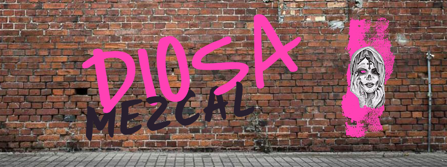
Re-Development
I redeveloped my logo and I am much more happy with the outcome. I think my new design appears more professional and overall had a better look and feel to it. I recreated it with the original three colours I had in my first development, but then also tried adding various other colours as well as layering colours to try and create the best overall outcome. In the end, I decided to go with one main brand colour to keep things clean and simple. I think the bold pink I chose is very effective, as it is bold and eye-catching without overpowering the rest of my design. Although pink may be considered to be a “girly” colour, I believe the shade of pink I have used and the way I have used it, to be subtle enough not single out any one customer or market. The new bottle mock-up I have used adds to the visual impact of my design, suits the design and sits right on the bottle. All elements of my design and product now appear clean, contemporary, minimal and professional while still being bold and youthful enough to attract both younger and older adults.
Development -Promotion
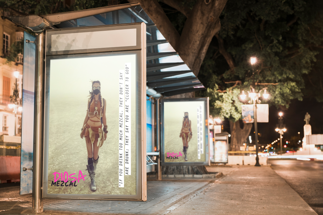
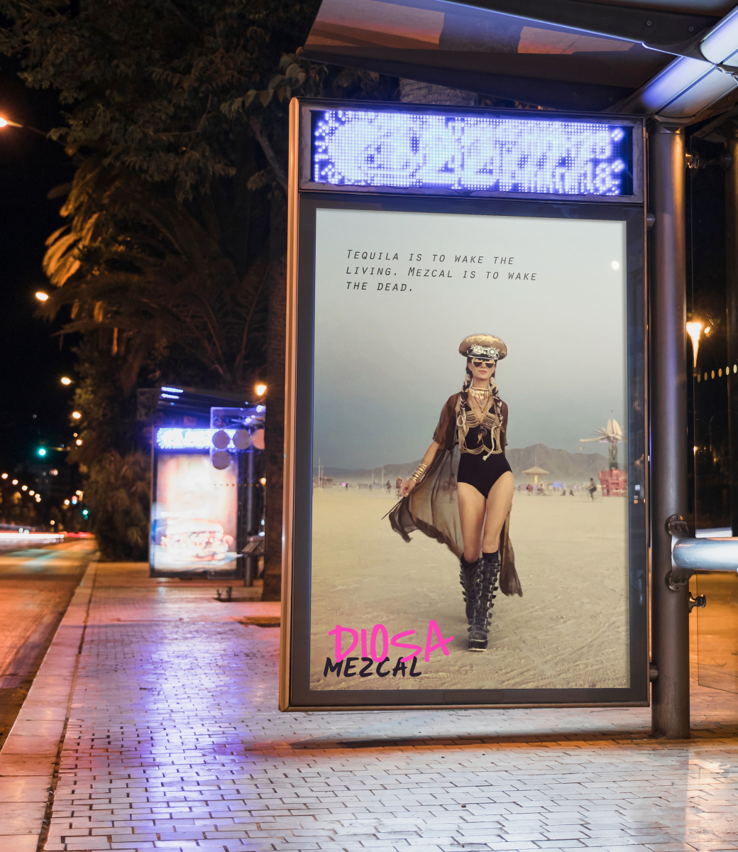
I have made a series of promotional products including a five double-page spread magazine, billboard posters and a wall vinyl. My magazine includes images of my products branding, the myth of mezcal, a mezcal cocktail recipe as well as images of people from the Burning Man Festival. I have used images of people from the Burning Man Festival as I think they represent the type of clientele my brand is aimed at as well as the types of events my brand would sponsor and be associated with. As part of my magazine, I have also added quotes from the book ‘Fear and Loathing in Las Vegas’ and general sayings that are popular, which reference mezcal that fit my branding perfectly. I’ve incorporated them into my work as memorable quotes that would make people remember the product and that could be used as hashtags or quoted to promote the brand and the product.
I have taken some of the images from Burning Man Festival along with the quotes and used them as posters for billboards to promote the brand. They are simple but effective as the eye-catching imagery is bold and memorable.
I think my end mezcal brand is effective and a good bold design. I really enjoy the end look, as I think it is a branding look that would work well in real life and appeal to a clientele of young adults and artists would have appreciated the product and design. The biggest flaw in my project is that I was unable to keep confident and organised, which has made my design suffer, as I could have produced more material to show off my brand and skills.
