For my major project, I have explored the issue of pollinator decline and how to effectively combat this issue by education and raising awareness. Pollinators, which are made up predominantly of insect species such as butterflies, moths, beetles, ants, wasps, flies and, the most prominent of all pollinators, bees. Amongst insects, other taxa such as birds, bats, rodents, reptiles as well as small marsupial and primates also contributed to pollination. A lot of current media campaigns focus solely on Bee species using them as a flagship animal to highlight awareness of these issues. This may have damaging effects though as it may be narrowing the public’s knowledge on pollination and other vital species which help to pollinate.
Link to Planning and Proposal: https://natalieharveydesign.wordpress.com/planning-for-major/
For my outcome, I have developed a campaign that would be run and published through The Wildlife Trust. I chose to run the campaign through a charity such as The Wildlife trust as they are a well-established and a known British charity dedicated to UK wildlife and already run various pollinator projects that tie in with my campaign. They are an organisation that also has a large demographic targeting people of all ages from different economic and social backgrounds as well as both urban and non-urban areas. These are important factors as the point of my artefact is to raise awareness to as many people as possible despite location, age or familiarity with the issue. By placing my artefact within a pre-existing organisation it will give the campaign stronger credibly and reach a larger audience from the offset. Then Through my use of colour, style and design, I hope to challenge previous campaigns to show more inclusivity of pollinating species as well as standing out from the uniform look of nature publications. By doing this I will raise awareness levels and reach a further audience field by creating a campaign that inspires creativity and curiosity about both the campaign and the issue.
Link to the public survey and Results: Major Survey
Artefact Development
-

- magazine mockup
-
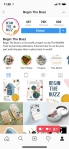
- instagram mockup
-
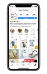
- instagram on phone mock up
-

- social medis mockup
-

- seed packet initial design
-
- seed packet mockup
-
- seed packet initial design
-
- seed packet mockup
-

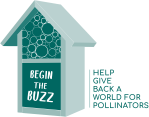
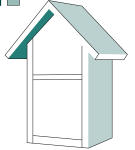
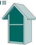
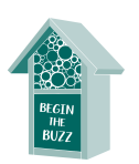
- insect house logo initial mock up and colours
-
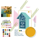
- initial poster design with colour pallets
-
- colour development
-
- poster development
-
- initial calendar design
-
- campaign development
-
- size and placement development
-
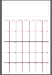
- developing calendar grid
-

- initial logo idea
-
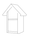
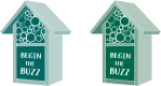
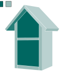
- building the insect house
-
- building the insect house
-

- building the insect house
-
- building the insect house
-
- building the insect house
-

- building the insect house
-
- building the insect house
-
- size and placement development
-
- size and placement development
-
- size and placement development
-
- calendar development
-
- calendar development
-
- calendar development
Illustrations
(hover over for species names)
(link to previous work on scientific illustration: https://natalieharveydesign.wordpress.com/contextual-studies-2/)


Previous Campaigns and Current Wildlife Publications for Comparison-


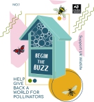
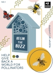
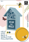
I have named the camping “Begin the Buzz” and by doing this I have created both a title, logo and slogan for the campaign that links both the need for activism with the onomatopoeic sounds made by bees and other insects. Yes, although the campaign is to raise awareness of more than just bees it on first impressions is catchy and grabs the audience whilst allowing giving an idea as to what the campaign is about so it can then further the issue. “Begin The Buzz” does unlike other campaigns such as “Save The Bees” not give way directly to a flagship animal as well as being a fresh phrase that can make an impact as over time people may have become de-sensitive to pre-existing phrases and ideas that are linked to campaign previously launched like the 2006 initiatives to “save the bees”.
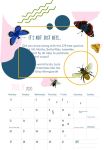
My colour palette for the campaign is a simple mix of four colours from each quarter of the colour wheeling allowing the colours to complement each other creating a contrast to allow each element of the design to stand out while the soft muted shades of each colour stop the elements and colours crashing with each other and becoming unbalanced. Each colour blue, green, yellow and pink are chosen as they also reflect the colours of nature, in particular wildflowers, which of course are one of the most important habitats and food source for pollinators. This allows the audience to connect straight away to the issue and the feeling of a colourful peaceful green space.
The majority of nature and wildlife publications such as magazine all share a very similar design of large hyper-detailed close-ups of wildlife and as amazing as the photography is, it is only going to attract an audience that is drawn to the image, and if draw the large amounts of text can be off-putting and overlooked if not familiar with the content. So, for the style and design of my campaign, I took a risk to make publications that are contemporary, abstract with elements of Scandi and Bauhaus influence. By using the simple four colours and designating them to four shapes to make up elements of the design it creates balance among the layering while still giving depth and texture. This essentially creates “something out of nothing” an interesting, unobjective design whose purpose is to simply stand out and draw an audience in through comfortably chaotic creative curiosity. Then by adding elements relating to the issues it gives the design a story, context and motive for its being. I created an insect house vector to create a housing for the logo/slogan (Begin The Buzz) which is an identifiable object with pollination as it is a habitat and in some sense creates an ecosystem within and around itself. By doing this it helps to make the logo and campaign more identifiable and will reach a further demographic including children and those with limited literacy. Together the logo made up of the insect house and word can be further used as promotional materials in the form of stickers, badges, poster elements to grab attention, give context and link the graphic elements with the illustrations on the publications and other parts of the campaign. I took a further risk by mixing hand-painted watercolour illustrations with the flat graphic elements. This gives detail which contrasts with the block shapes and gives a realistic organic depiction of pollinations which allows them to be more identifiable by an audience and allows for a more emotional connection compared to pixel perfect flat digital graphics. It allows the audience to resonate more as well by seeming more personal like something a family member such as a grandchild may paint. I have mixed different species of bees, moths, butterflies and beetles to show variety amongst pollinators. I have not included animals such as birds, and mammals on the front of publication as although they play an important role I was informed by the RSPB and Bat Conservation Trust after contacting them, there is little evidence of UK species pollinating compared to international species such as Humming Birds or Bats in America. I felt that as the campaign is to be published through a UK wildlife Charity it was better judgment to focus on UK species for the illustration but still give recognition to international pollinators through the information and articles incorporated within UK based publications.
I have used the typeface ‘Chocolate DRINK’ for the slogan and main tiles because it gives a handwritten aesthetic which complements the hand-painted illustration and stands out from the smooth uniform graphic shapes. This again is different from the normal serif fonts used on pre-existing nature publications and gives a warmer familiar look and feel to the design, evoking people to care. I matched the rest of the text by using ‘Comfortaa’ as it is easy to read soft rounded fonts which help to balance the design by blending with the graphic elemental shapes. I coloured the text blue to tie in the soft appearance of the publications giving balance and uniformity to the design while relying on the use of negative space and text hierarchy to dictate the importance of the search text box. I have used a limited amount of text to keep the designs from becoming too busy and stop the import information becoming lost. This allows the reader/audience to quickly scan and understand the key messages/ context. It will also reduce the chance of some who are unfamiliar with the issue from feeling overwhelmed with the information they are being presented with, allowing them to feel in control of what they are learning, helping them to understand the issue better too.
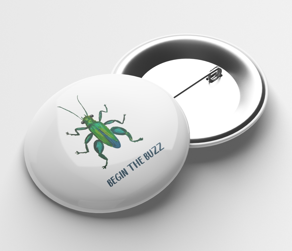
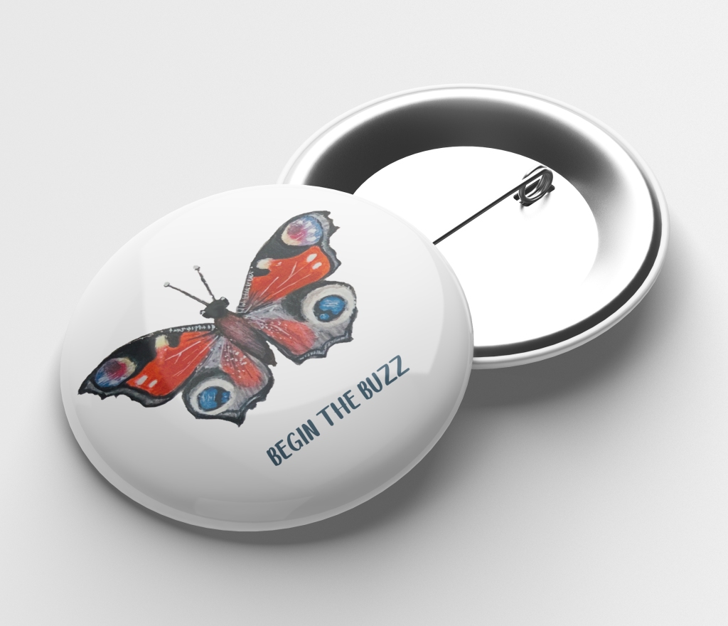
The artefact of my campaign involves both print and digital versions to allow for a large demographic to be reached regardless of access to things such as social media, internet or equally printed copies sent via post or bought. This also allows for the campaign to spread fast as well and catch people’s eye whether at a shop, scrolling on their phone, on the bus or at home. I have included stickers, posters and badges as part of the campaign as they act as a collectable reminder wherever they see the issue and are styled without a focused marketing demographic giving them a design attractive and wearable/achieved by people of all ages and backgrounds. The social media aspect and magazine can be followed/ collected to create a library of information on species, how to help, and information relating to the issue. While the children’s version of the magazine contains information and activities to give awareness of the issues but importantly educate and be interactive. Including ideas and activities in both versions of the publication get the audience to interact with the issue and become familiar and connect with the problem thus finding a solution to solve it.
Culturally there is a rise in people taking an interest in wildlife and conservation as we see more and more species declines. Because of this now is an ideal time for campaigns like this we see more parts of the industry go paper-free, recycle and use recycled products which are equally replicated in the homes of the potential audience. Having an artefact that builds on newly emerging cultural values and more values ideas helps to solidify its effectiveness in relation to the issue. Equally by making sure any artefacts are shown to be recycled and recyclable as well as made with materials and processes that are ecofriendly is important to increase the credibility of the campaign as well as the trust supporting it with the potential consumers.
Final Artefact Outcomes
-
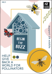
- Children’s Magazine
-
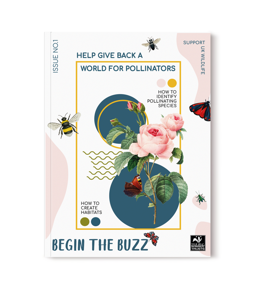
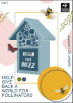
- Magazine
-

- Promotional Badges
-
- Promotional Badges
-
- Promotional Badges
-
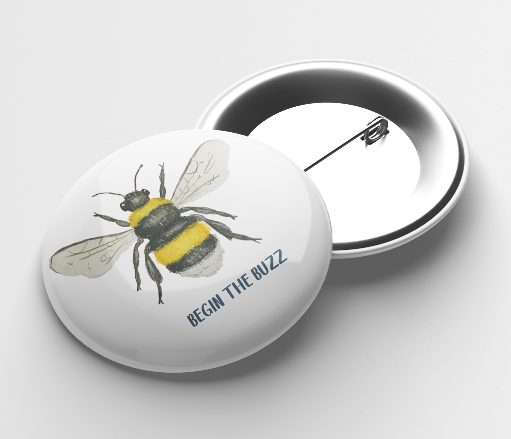
- Promotional Badges
-
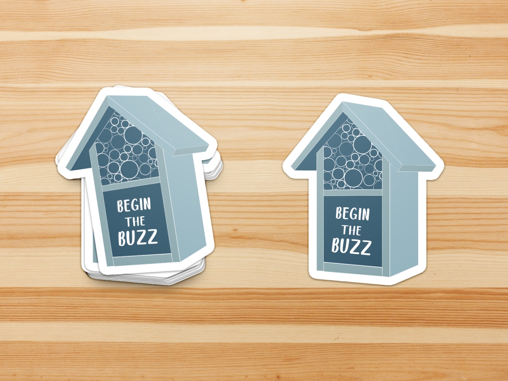
- Promotional stickers
-
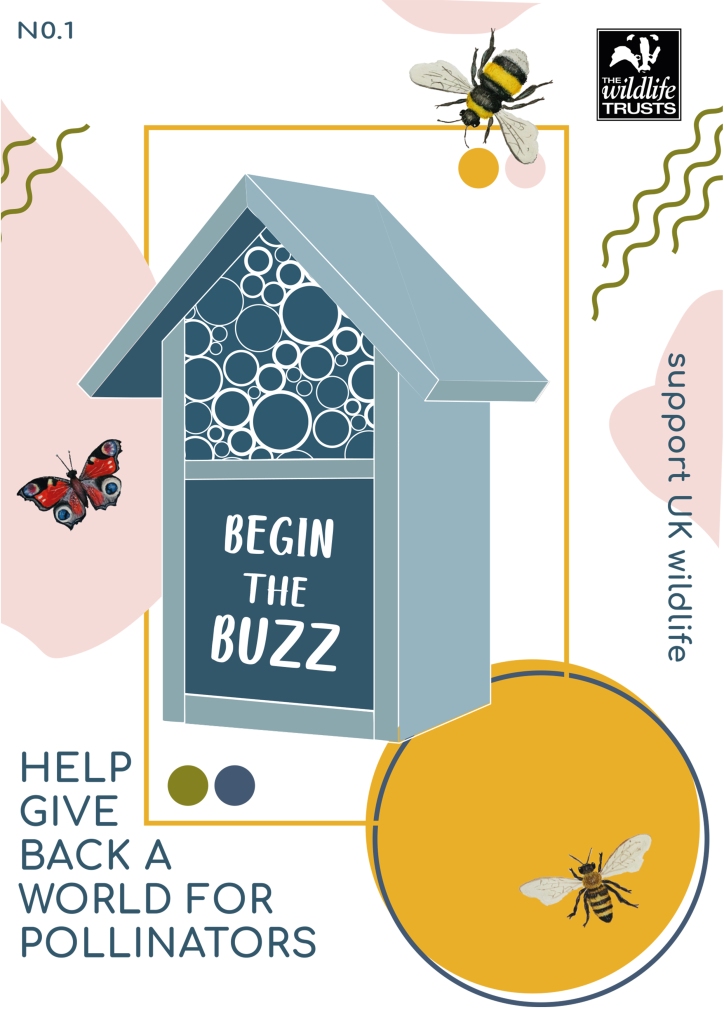
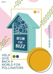
- Poster
-
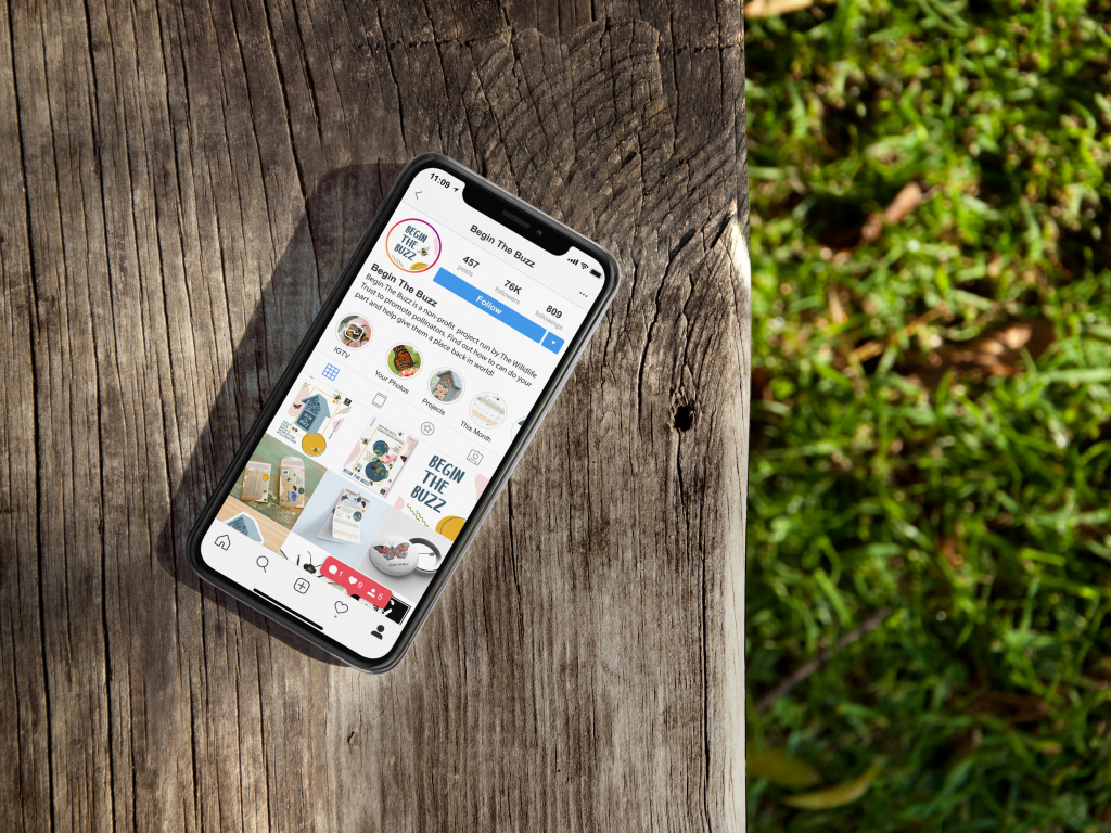
- social media mockup
-

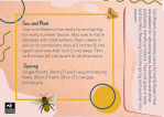
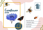
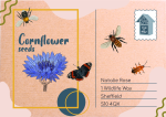
- seed packet postcard front
-
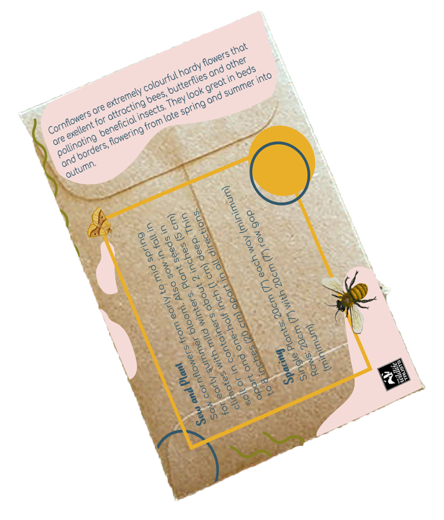
- seed packet postcard back
-
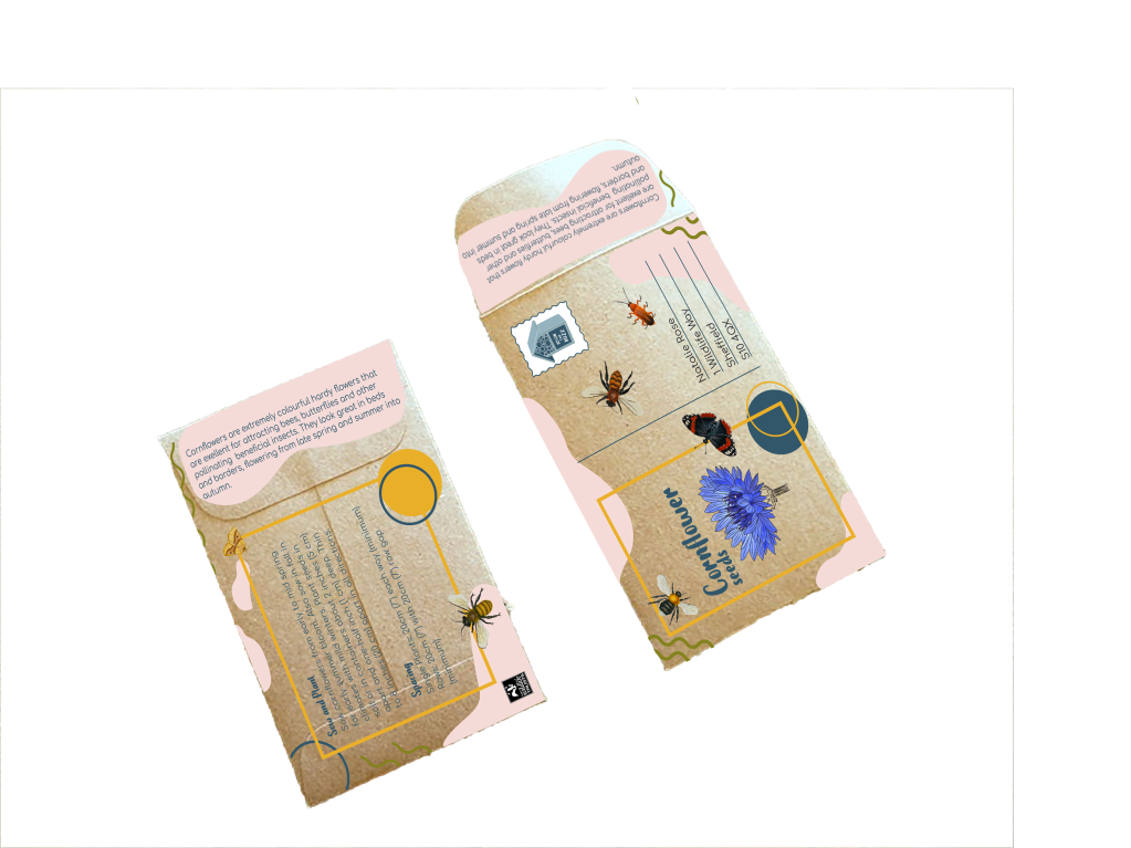
- seed packet postcard
-
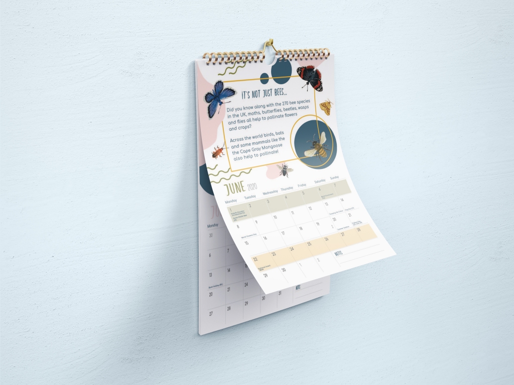
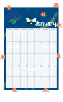
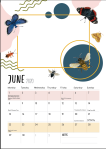
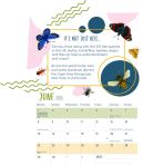
- calendar
-

- calendar
-

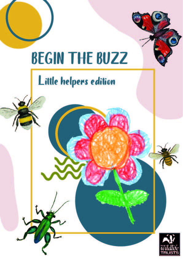
- Children’s Magazine mock up
The evaluation of my artefact is that it is a good entry point in order to effectively solve the problem of a lack of knowledge in the issue and the understanding of how to help. The artefact shows a way to spread the campaign in the most simplistic way which eases both financial and workload impact on the charity launching the project. This is import as the campaign is to support the work of The Wildlife Trust not to become an additional burden and take away from their work. By having the campaign both digital and print it allow for it to be received by a greater demographic which was an important factor of the project. It is an effective way to solve the problem of it being unattainable because of location or economic background which allow for a greater audience.
The design shows a willingness to take risks to create an artefact which is fresh, current and considered ‘out of the box’ from the typical look of wildlife and nature publications. The purpose of the risk is to stand out and not get lost within other publications of any genre. By standing out the issue looks more apparent and will grab the attention of a greater audience, thus allowing the issue to reach the wider audience. The design moves away from the atypical and is, therefore, a risk for that nature genre of publication but we know from other current trends that scandi and Bauhaus publication are a popular style choice for fashion, art and even some food publications as a fresh way to give clarity to the visual elements of design which we have seen in work like ‘The Gentlewoman’ magazine and the Het Nieuwe Instituut, Speculative Design Archive Exhibition Posters. This was a risk to effectively rebrand nature and wildlife to appear currently and appear as art rather than simply just the subject of art.
The outcome shows a substantial and effect visual major outcome by showing the development in placement to create a balanced design as well as practical solutions to create a campaign. The development of a multi-use logo that can be replicated on several mediums giving the campaign a recognition; which is integral to getting the audience to connect to the issue more effectively than previous campaigns. The logo achieves this by urging the audience to engage with the issue at the grassroots through dialoge, imploring people to discuss, share and educate on the issue. Asking an audience to “begin” to take notice is much more achievable than overwhelming them to “save the bees” like previous campaigns. This idea is then reinforced further by only having key messages on the posters and magazines. This stops the important points from getting lost in irrelevant text and becoming overwhelming to an audience. This all helps to increase how effective the campaigns/ artefacts are in setting them apart from other campaign and growing the issue from more than just save the bees.
The Calendar and monthly seed packet postcard and magazine are effective and a substantial part of the campaign by making people aware of wildlife events and key times in nature. This helps to increase the public’s knowledge and understanding of the issue allowing them to feel more capable of giving support and acting in relation to the issue. By having them work on a monthly timeframe it also keeps the issue relevant and fresh at a personal level. A lot of one-time campaigns can be easily forgotten, or their importance reduced, and we see this in the original 2006 bee crisis. It was hung news being featured on newspapers, the evening news and even leading to the realising of the ‘Bee Movie” but as fast as it gains the notoriety it lost relevance. The importance of keeping up with content that is interesting and interactive is an effective move to keep the audience engaged with the issue.
I shared the poster cover across several media platforms, and it received positive praise from the public, wildlife organisations and design blogs. Everyone found it very aesthetically pleasing and eye-catching which some members of the public requesting copies to place as artwork in their homes. This re-establishes me as a confident professional practitioner with an effective design in this current period.


Reflecting upon my artefact I am aware that more could have been done to produce more artefacts to show a greater impact of the campaign in order to set it apart and make it more effective against other campaigns. Although I did effectively show a range of insect illustration including several species of bees, butterflies, moths and beetle a better worked out time frame would have allowed for a greater range including flies, hoverflies and wasps. Furthermore, with more effective time management, I would have liked to increase the campaign to cover the issue internationally. This would have given to issue more weight and really show the impact on health, agriculture and economy loss of pollinators have.
Again, on reflection, I would have taken greater risk not just in the design but in the materials, technologies and processes available to create a campaign which truly stood apart from previous campaigns. By make more use of these factors would have meant I could make a campaign that really supports the issue in a time of media convergence. Multi-platform animation, information packs and educational supplies would have all greatly benefited the campaign, issue and filled the gaps left by other campaigns. This I believe would have made a strong impact on the overall strength of the campaign compared to preexisting efforts like the Friends of the Earth bee campaigns.
Overall, I think I demonstrate the skills to effectively problem solve, take risks and apply my knowledge effectively from the development too the outcome of the project. I created a substantial effective visual major artefact. Although on reflection more could have been done and exceptions more could have been done to increase how effect and substantial it could be. I showed that I can critically evaluate and contest the critical and cultural relationships of my work by referring to previous work, cultural and current trends, the industries eco outlook and how the potential audience may and did respond. I demonstrated confidence in my design and decisions by taking risks to produce an artefact that breaks conventional appears if the genre. Lastly, I effectively led research and a public survey to which I then listened to the response and in turn responded with an appropriate successful artefact.
