Corporate Marques and Logotypes


World Wildlife Fund
The World Wildlife Fund which is also known as The World Wide Fund for Nature and WWF, has a universally recognised logo which remains a influential symbol for the primary focus of the WWF’s work: the conservation, preservation and restoration of natural environments around the world.
The inspiration for the logo came from a giant panda named Chi Chi that had arrived at the London Zoo in the year 1961, when WWF was being created. Aware of the need for a strong, recognisable symbol that would overcome all language barriers, WWF’s founders agreed that the big, furry animal with her appealing, black-patched eyes would make an excellent logo.
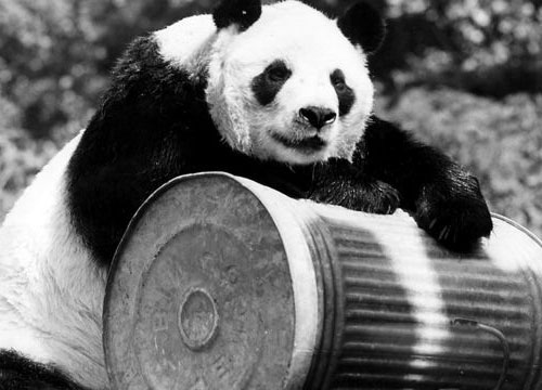
The original panda logo was designed in 1961 by WWF’s founder chairman, the naturalist and painter Sir Peter Scott who said at the time;
“We wanted an animal that is beautiful, is endangered, and one loved by many people in the world for its appealing qualities. We also wanted an animal that had an impact in black and white to save money on printing costs.”
The logo has been redrawn several times in the organisation’s 50 year history, although not since 2000. Design studio ASHA gave the brand a refresh last year in which it introduced a panda stencil, allowing imagery to show through parts of the panda logo that would normally appear black . “The stencil enables the iconic shape to become a lens to help express the breadth of our work,” explains Bridge. “Also, we can use new media and especially the moving image to really bring our work to life and let people see ‘what’s behind the panda’.”


The firm responsible for the 1986 logo was the San Francisco office of Landor. Tom Suiter was the creative director, Jerry Kuyper was the design director and Jenny Leibundgut was the primary designer. Prior to their work WWF was using two different pandas, one in the USA (a colder, more geometric version of the 1978 version) and one for the rest of the world.
Jerry Kuyper remembers, their working attributes were:
– not too cuddly
– not too ferocious
– and most certainly, not about to go extinct
The black-and-white panda has since come to stand as a symbol for the conservation movement as a whole.
First official poster of WWF from 1961. This official poster was so designed that it could be easily produced with the wording in any language.Designed and produced by Ogilvy & Mather.

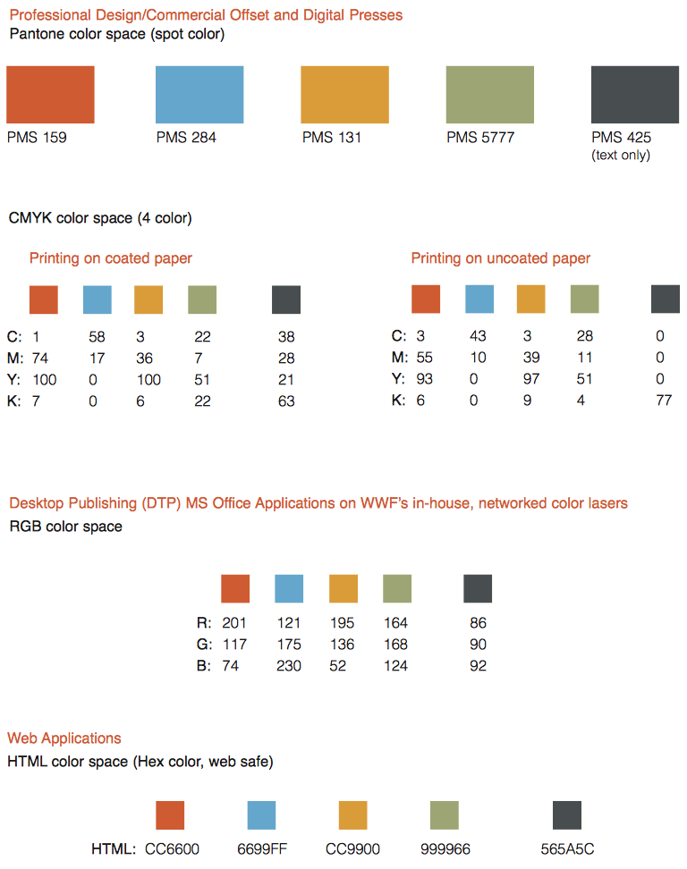
WWFs New Colour Palette in Use
Typeface
The WWF use Helvetica as there main typeface as they feel it has a modern feel and a clean appearance. All WWF materials – whether stationery, emails, publications, advertising, signs or websites – use the Helvetica typeface. Helvetica Light is preferred for all body text and headlines in documents.


By using the WWF logo on a reusable bag, WWF is able to reinforce one of their goals of reuse and recycle to help the environment as well as using recognisable colours and the white negative space to make up the panda making it a bold and recognisable design.

By using WWF photography and the logo on debit cards the WWF create bold, distinctive and eye catching design which straight way promotes and reminds use of the animals that they work with as well as creating a psychology that should effectively make people want to donate by making a connection between the company and the money on their cards.

Once again WWF uses creates minimal designs by simply using the negative space of the base colour to create and contrast with the black panda shapes. The production of thinks like cups creates a practical and functional way to advertise the company and other promotions such as adoption packs.

By creating a seasonal magazine WWF have been able to update subscribers of their work as well effectively showing a higher quality of photography that is styled to their identity. The logo is used in several different way to connect the relevant story or information such as replacing the black with photography of forest and ocean which effectively show the brand identity and gives context to the information.
Chupa Chups
Popular lollipop brand Chupa Chups was founded by Spaniard Enric Bernat in 1958. The brand is part of the Italian multinational Van Melle, The company includes famous brands, such as Mentos, Smint or Fruitella
Enric Bernat: “I saw something tasty that wasn’t very convenient for our most important consumers: children. Their hands got sticky, causing them to get in trouble with their parents. So I put the candy on a stick.” Quoted from Enric’s obituary on The Guardian website.
Bernat called the product ‘GOL’ (‘goal’ in Spanish). In his imagination the candy was like a football and the open mouth like a goal. The product didn’t sell well at first. Bernat hired an advertising agency, that came up with the brand ‘Chupa Chups’ which is taken from the Spanish verb chupar, ‘to suck’.
In 1969 Bernat complained about the lack of a suitable logo for his brand while drinking coffee with his friend and artist, Salvador Dalí.
“Do you need a logo? Dali said. “No problem!’ The famous surrealistic painter, known for his remarkable moustache and his paintings with melting clocks, immediately started working on it.
Dalí integrated the wordmark using elegant letters in a daisy. Dalí insisted on putting his design on top of the lollipop instead of on the side. This way, the logo was always fully visible and made the produce have a better presentation.
![]()


Vans
The shoe company ‘Vans’ was founded in California in 1966 Brothers Paul Van Doren and Jim Van Doren along with partners Gordon Lee and Serge Delia open for business at 704 E. Broadway in Anaheim, Calif. on March 16.
The original version of the Vans skateboard logo was designed by Mark Van Doren at the age of 13. Mark designed the logo as a stencil to be spray painted on his skateboards and was then initially introduced for the heel tab on an early Vans’ skateboard shoe, the Style 95, this original Vans skateboard logo is an important part of Vans history.
The Vans logo has changed slightly over the years, but a couple of key design elements are always included. Its “Off the Wall” slogan calls attention to the company’s athletic ties and quirky background.
The very first customers who bought Vans could not pick them up directly in the store. The Van Doren brothers who founded the company would have customers pick shoes based on a prototype and then manufacturer and stamp the logo on the shoes on the premises. Customers had to come back the next day to receive their purchases.
Though Vans shoes are mostly known to skaters, music fans may be more familiar with seeing the Vans logo on the Warped Tour sign. This traveling rock festival sponsored by Vans is the longest-running touring festival on the continent.
Vans Logo Design Elements
The current logo for Vans is a combination of a brand name and a slogan. At the top of the logo is a wide, red rectangle that is a slightly warm, orange-ish shade. In white capitalized letters, the name “Vans” is spelled out within the rectangle. The V is slightly larger than the other letters, and the right point of the V extends in a horizontal line that tops the rest of the letters.
Beneath the rectangle is a set of quotation marks that contain the phrase “Off the Wall.” The brand slogan is written in black, but it is written in the same font as the rest of the logo. This all-caps, san-serif font features thick lines of a consistent width and few curves.
Changes and Evolution
![]()
1. Shape
The modern day Vans logo is very similar to its original logo tag that showed up on their first few pairs of shoes. That showed the brand name in a rectangle without the “off the wall” motto. In 1976, this was changed to a logo that had the brand name and motto inside of a stylized Van shape. Though the popular vehicle logo still shows up on some Vans merchandise, the company decided to switch their logo to the simpler rectangular design of modern times because it appeared more modern than the skewed 1970s style drawing.
2. Color
Earlier pairs of Vans sported a white tag with the writing in blue. When the logo was changed to the van shape, a bright orangey-red was chosen that stood out more. After briefly changing to a duller black and white version, the company decided to restore their original red. The modern logo now uses red and white for the brand name and black for the motto.


3. Font
All versions of the Vans logo have used a thick, bold, capitalized san serif font that extends the V in a line above the rest of the letters. This font is a customized modification of the Helvetica font that was first developed in the 1950s and became wildly popular for advertising in the 1970s.
![]()
Influences/Inspiration
Like many of the shoe designs, the Vans logo is directly inspired by the skaters who wore them. At the time, skaters liked to practice fancy tricks in the many empty pools of California. The skaters called this going “off the wall,” and it was a fun trick that even newer skaters could manage. This phrase is also used to describe a quirky or eccentric person, so it fit in perfectly with the Vans image. Though the Vans brand got its name from the Van Doren brothers who founded it, the name also inspired the earlier van-shaped logo of the brand.


All of the corporate identities I have researched have minimal but effect designs which made them instantly recognisable and all stand out and above similar companies. They all make the most of typeface and negative space/ shape to create effective, memorable identifies that can be applied to a large range of promotions and products.
References:
http://www.creativebloq.com/inspiration/wwf-concept-logo-reflects-todays-most-vulnerable-creature
https://www.leoprinting.co.uk/blog/salvador-dali-chupa-chups-logo/
Click to access WWFUS_brandbook_0207.pdf
